
diff options
Diffstat (limited to 'docs/src')
38 files changed, 4171 insertions, 0 deletions
diff --git a/docs/src/components/ArticleFooter.astro b/docs/src/components/ArticleFooter.astro new file mode 100644 index 000000000..48de51054 --- /dev/null +++ b/docs/src/components/ArticleFooter.astro @@ -0,0 +1,16 @@ +--- +import AvatarList from './AvatarList.astro'; +const { path } = Astro.props; +--- + +<footer> + <AvatarList path={path} /> +</footer> + +<style> +footer { + margin-top: auto; + padding: 2rem 0; + border-top: 3px solid var(--theme-divider); +} +</style> diff --git a/docs/src/components/AstroLogo.astro b/docs/src/components/AstroLogo.astro new file mode 100644 index 000000000..ff1939ad9 --- /dev/null +++ b/docs/src/components/AstroLogo.astro @@ -0,0 +1,20 @@ +--- +const {size} = Astro.props; +--- +<svg class="logo" width={size} height={size} viewBox="0 0 256 256" fill="none" xmlns="http://www.w3.org/2000/svg"> + <style> + #flame { + /* fill: #ff5d01; */ + fill: #3894ff; + } + #a { + /* fill: #000014; */ + fill: #3894ff; + } + </style> + <title>Logo</title> + <path id="a" fill-rule="evenodd" clip-rule="evenodd" + d="M163.008 18.929c1.944 2.413 2.935 5.67 4.917 12.181l43.309 142.27a180.277 180.277 0 00-51.778-17.53l-28.198-95.29a3.67 3.67 0 00-7.042.01l-27.857 95.232a180.225 180.225 0 00-52.01 17.557l43.52-142.281c1.99-6.502 2.983-9.752 4.927-12.16a15.999 15.999 0 016.484-4.798c2.872-1.154 6.271-1.154 13.07-1.154h31.085c6.807 0 10.211 0 13.086 1.157a16.004 16.004 0 016.487 4.806z" /> + <path id="flame" fill-rule="evenodd" clip-rule="evenodd" + d="M168.19 180.151c-7.139 6.105-21.39 10.268-37.804 10.268-20.147 0-37.033-6.272-41.513-14.707-1.602 4.835-1.961 10.367-1.961 13.902 0 0-1.056 17.355 11.015 29.426 0-6.268 5.081-11.349 11.349-11.349 10.743 0 10.731 9.373 10.721 16.977v.679c0 11.542 7.054 21.436 17.086 25.606a23.27 23.27 0 01-2.339-10.2c0-11.008 6.463-15.107 13.974-19.87 5.976-3.79 12.616-8.001 17.192-16.449a31.024 31.024 0 003.743-14.82c0-3.299-.513-6.479-1.463-9.463z" /> +</svg>
\ No newline at end of file diff --git a/docs/src/components/AvatarList.astro b/docs/src/components/AvatarList.astro new file mode 100644 index 000000000..09fc089b9 --- /dev/null +++ b/docs/src/components/AvatarList.astro @@ -0,0 +1,151 @@ +--- +// fetch all commits for just this page's path +const { path } = Astro.props; +const url = `https://api.github.com/repos/snowpackjs/astro-docs/commits?path=${path}`; +const commitsURL = `https://github.com/snowpackjs/astro-docs/commits/main/${path}`; + +async function getCommits(url) { + try { + const token = import.meta.env.SNOWPACK_PUBLIC_GITHUB_TOKEN; + if (!token) { + throw new Error( + 'Cannot find "SNOWPACK_PUBLIC_GITHUB_TOKEN" used for escaping rate-limiting.' + ); + } + + const auth = `Basic ${Buffer.from(token, "binary").toString("base64")}`; + + const res = await fetch(url, { + method: "GET", + headers: { + Authorization: auth, + "User-Agent": "astro-docs/1.0", + }, + }); + + const data = await res.json(); + + if (!res.ok) { + throw new Error( + `Request to fetch commits failed. Reason: ${res.statusText} + Message: ${data.message}` + ); + } + + return data; + } catch (e) { + console.warn(`[error] /src/components/AvatarList.astro + ${e?.message ?? e}`); + return new Array(); + } +} + +function removeDups(arr) { + if (!arr) { + return new Array(); + } + let map = new Map(); + + for (let item of arr) { + let author = item.author; + // Deduplicate based on author.id + map.set(author.id, { login: author.login, id: author.id }); + } + + return Array.from(map.values()); +} + +const data = await getCommits(url); +const unique = removeDups(data); +const recentContributors = unique.slice(0, 3); // only show avatars for the 3 most recent contributors +const additionalContributors = unique.length - recentContributors.length; // list the rest of them as # of extra contributors + +--- +<!-- Thanks to @5t3ph for https://smolcss.dev/#smol-avatar-list! --> +<div class="contributors"> +<ul class="avatar-list" style={`--avatar-count: ${recentContributors.length}`}> + +{recentContributors.map((item) => ( + <li><a href={`https://github.com/${item.login}`}><img alt={`Contributor ${item.login}`} title={`Contributor ${item.login}`} width="64" height="64" src={`https://avatars.githubusercontent.com/u/${item.id}`}/></a></li> + +))} + </ul> + {additionalContributors > 0 && <span><a href={commitsURL}>{`and ${additionalContributors} additional contributor${additionalContributors > 1 ? 's' : ''}.`}</a></span>} + {unique.length === 0 && <a href={commitsURL}>Contributors</a>} +</div> + +<style> +.avatar-list { + --avatar-size: 2.5rem; + --avatar-count: 3; + + display: grid; + list-style: none; + /* Default to displaying most of the avatar to + enable easier access on touch devices, ensuring + the WCAG touch target size is met or exceeded */ + grid-template-columns: repeat( + var(--avatar-count), + max(44px, calc(var(--avatar-size) / 1.15)) + ); + /* `padding` matches added visual dimensions of + the `box-shadow` to help create a more accurate + computed component size */ + padding: 0.08em; + font-size: var(--avatar-size); +} + +@media (any-hover: hover) and (any-pointer: fine) { + .avatar-list { + /* We create 1 extra cell to enable the computed + width to match the final visual width */ + grid-template-columns: repeat( + calc(var(--avatar-count) + 1), + calc(var(--avatar-size) / 1.75) + ); + } +} + +.avatar-list li { + width: var(--avatar-size); + height: var(--avatar-size); +} + +.avatar-list li:hover ~ li a, +.avatar-list li:focus-within ~ li a { + transform: translateX(33%); +} + +.avatar-list img, +.avatar-list a { + display: block; + border-radius: 50%; +} + +.avatar-list a { + transition: transform 180ms ease-in-out; +} + +.avatar-list img { + width: 100%; + height: 100%; + object-fit: cover; + background-color: #fff; + box-shadow: 0 0 0 0.05em #fff, 0 0 0 0.08em rgba(0, 0, 0, 0.15); +} + +.avatar-list a:focus { + outline: 2px solid transparent; + /* Double-layer trick to work for dark and light backgrounds */ + box-shadow: 0 0 0 0.08em var(--theme-accent), 0 0 0 0.12em white; +} + +.contributors { + display: flex; + align-items: center; +} + +.contributors > * + * { + margin-left: .75rem; +} +</style> diff --git a/docs/src/components/DocSidebar.tsx b/docs/src/components/DocSidebar.tsx new file mode 100644 index 000000000..24e9dc4d9 --- /dev/null +++ b/docs/src/components/DocSidebar.tsx @@ -0,0 +1,65 @@ +import type { FunctionalComponent } from 'preact'; +import { h } from 'preact'; +import { useState, useEffect, useRef } from 'preact/hooks'; +import EditOnGithub from './EditOnGithub'; + +const DocSidebar: FunctionalComponent<{ headers: any[]; editHref: string }> = ({ + headers = [], + editHref, +}) => { + const itemOffsets = useRef([]); + const [activeId, setActiveId] = useState<string>(undefined); + + useEffect(() => { + const getItemOffsets = () => { + const titles = document.querySelectorAll('article :is(h1, h2, h3, h4)'); + itemOffsets.current = Array.from(titles).map((title) => ({ + id: title.id, + topOffset: title.getBoundingClientRect().top + window.scrollY, + })); + }; + + getItemOffsets(); + window.addEventListener('resize', getItemOffsets); + + return () => { + window.removeEventListener('resize', getItemOffsets); + }; + }, []); + + return ( + <nav class="sidebar-nav"> + <div class="sidebar-nav-inner"> + <h2 class="heading">On this page</h2> + <ul> + <li + class={`header-link depth-2 ${ + activeId === 'overview' ? 'active' : '' + }`.trim()} + > + <a href="#overview">Overview</a> + </li> + {headers + .filter(({ depth }) => depth > 1 && depth < 4) + .map((header) => ( + <li + class={`header-link depth-${header.depth} ${ + activeId === header.slug ? 'active' : '' + }`.trim()} + > + <a href={`#${header.slug}`}>{header.text}</a> + </li> + ))} + </ul> + <h2 class="heading">More</h2> + <ul> + <li class={`header-link depth-2`}> + <EditOnGithub href={editHref} /> + </li> + </ul> + </div> + </nav> + ); +}; + +export default DocSidebar; diff --git a/docs/src/components/EditOnGithub.tsx b/docs/src/components/EditOnGithub.tsx new file mode 100644 index 000000000..5ff74e364 --- /dev/null +++ b/docs/src/components/EditOnGithub.tsx @@ -0,0 +1,25 @@ +import type { FunctionalComponent } from 'preact'; +import { h } from 'preact'; + +const EditOnGithub: FunctionalComponent<{ href: string }> = ({ href }) => { + return ( + <a class="edit-on-github" href={href}> + <svg + preserveAspectRatio="xMidYMid meet" + height="1em" + width="1em" + fill="currentColor" + xmlns="http://www.w3.org/2000/svg" + viewBox="0 0 438.549 438.549" + stroke="none" + > + <g> + <path d="M409.132 114.573c-19.608-33.596-46.205-60.194-79.798-79.8-33.598-19.607-70.277-29.408-110.063-29.408-39.781 0-76.472 9.804-110.063 29.408-33.596 19.605-60.192 46.204-79.8 79.8C9.803 148.168 0 184.854 0 224.63c0 47.78 13.94 90.745 41.827 128.906 27.884 38.164 63.906 64.572 108.063 79.227 5.14.954 8.945.283 11.419-1.996 2.475-2.282 3.711-5.14 3.711-8.562 0-.571-.049-5.708-.144-15.417a2549.81 2549.81 0 0 1-.144-25.406l-6.567 1.136c-4.187.767-9.469 1.092-15.846 1-6.374-.089-12.991-.757-19.842-1.999-6.854-1.231-13.229-4.086-19.13-8.559-5.898-4.473-10.085-10.328-12.56-17.556l-2.855-6.57c-1.903-4.374-4.899-9.233-8.992-14.559-4.093-5.331-8.232-8.945-12.419-10.848l-1.999-1.431c-1.332-.951-2.568-2.098-3.711-3.429-1.142-1.331-1.997-2.663-2.568-3.997-.572-1.335-.098-2.43 1.427-3.289 1.525-.859 4.281-1.276 8.28-1.276l5.708.853c3.807.763 8.516 3.042 14.133 6.851 5.614 3.806 10.229 8.754 13.846 14.842 4.38 7.806 9.657 13.754 15.846 17.847 6.184 4.093 12.419 6.136 18.699 6.136 6.28 0 11.704-.476 16.274-1.423 4.565-.952 8.848-2.383 12.847-4.285 1.713-12.758 6.377-22.559 13.988-29.41-10.848-1.14-20.601-2.857-29.264-5.14-8.658-2.286-17.605-5.996-26.835-11.14-9.235-5.137-16.896-11.516-22.985-19.126-6.09-7.614-11.088-17.61-14.987-29.979-3.901-12.374-5.852-26.648-5.852-42.826 0-23.035 7.52-42.637 22.557-58.817-7.044-17.318-6.379-36.732 1.997-58.24 5.52-1.715 13.706-.428 24.554 3.853 10.85 4.283 18.794 7.952 23.84 10.994 5.046 3.041 9.089 5.618 12.135 7.708 17.705-4.947 35.976-7.421 54.818-7.421s37.117 2.474 54.823 7.421l10.849-6.849c7.419-4.57 16.18-8.758 26.262-12.565 10.088-3.805 17.802-4.853 23.134-3.138 8.562 21.509 9.325 40.922 2.279 58.24 15.036 16.18 22.559 35.787 22.559 58.817 0 16.178-1.958 30.497-5.853 42.966-3.9 12.471-8.941 22.457-15.125 29.979-6.191 7.521-13.901 13.85-23.131 18.986-9.232 5.14-18.182 8.85-26.84 11.136-8.662 2.286-18.415 4.004-29.263 5.146 9.894 8.562 14.842 22.077 14.842 40.539v60.237c0 3.422 1.19 6.279 3.572 8.562 2.379 2.279 6.136 2.95 11.276 1.995 44.163-14.653 80.185-41.062 108.068-79.226 27.88-38.161 41.825-81.126 41.825-128.906-.01-39.771-9.818-76.454-29.414-110.049z"></path> + </g> + </svg> + <span>Edit on GitHub</span> + </a> + ); +}; + +export default EditOnGithub; diff --git a/docs/src/components/MenuToggle.tsx b/docs/src/components/MenuToggle.tsx new file mode 100644 index 000000000..605581077 --- /dev/null +++ b/docs/src/components/MenuToggle.tsx @@ -0,0 +1,44 @@ +import type { FunctionalComponent } from 'preact'; +import { h, Fragment } from 'preact'; +import { useState, useEffect } from 'preact/hooks'; + +const MenuToggle: FunctionalComponent = () => { + const [sidebarShown, setSidebarShown] = useState(false); + + useEffect(() => { + const body = document.getElementsByTagName('body')[0]; + if (sidebarShown) { + body.classList.add('mobile-sidebar-toggle'); + } else { + body.classList.remove('mobile-sidebar-toggle'); + } + }, [sidebarShown]); + + return ( + <button + type="button" + aria-pressed={sidebarShown ? 'true' : 'false'} + id="menu-toggle" + onClick={() => setSidebarShown(!sidebarShown)} + > + <svg + xmlns="http://www.w3.org/2000/svg" + width="1em" + height="1em" + fill="none" + viewBox="0 0 24 24" + stroke="currentColor" + > + <path + stroke-linecap="round" + stroke-linejoin="round" + stroke-width="2" + d="M4 6h16M4 12h16M4 18h16" + /> + </svg> + <span className="sr-only">Toggle sidebar</span> + </button> + ); +}; + +export default MenuToggle; diff --git a/docs/src/components/Note.astro b/docs/src/components/Note.astro new file mode 100644 index 000000000..c3ae29cb4 --- /dev/null +++ b/docs/src/components/Note.astro @@ -0,0 +1,48 @@ +--- +const { type = 'tip', title } = Astro.props; +--- + +<aside class={`note type-${type}`}> + {title && <label>{title}</label>} + <slot /> +</aside> + +<style> + .note { + --padding-block: 1rem; + --padding-inline: 1.25rem; + + display: flex; + flex-direction: column; + + padding: var(--padding-block) var(--padding-inline); + margin-left: calc(var(--padding-inline) * -1); + margin-right: calc(var(--padding-inline) * -1); + + background: var(--theme-bg-offset); + border-left: calc(var(--padding-inline) / 2) solid var(--color); + border-radius: 0; + } + + .note label { + font-weight: 500; + color: var(--color); + } + + /* .note :global(a) { + color: var(--color); + } */ + + .note.type-tip { + --color: var(--color-green); + --color-rgb: var(--color-green-rgb); + } + .note.type-warning { + --color: var(--color-yellow); + --color-rgb: var(--color-yellow-rgb); + } + .note.type-error { + --color: var(--color-red); + --color-rgb: var(--color-red-rgb); + } +</style> diff --git a/docs/src/components/SiteSidebar.astro b/docs/src/components/SiteSidebar.astro new file mode 100644 index 000000000..6d003d71d --- /dev/null +++ b/docs/src/components/SiteSidebar.astro @@ -0,0 +1,69 @@ +--- +import { sidebar } from '../config.ts'; +const {currentPage} = Astro.props; +--- + + +<nav> + <ul class="nav-groups"> + {sidebar.map(category => ( + <li> + <div class="nav-group"> + <h2 class="nav-group-title">{category.text}</h2> + <ul> + {category.children.map(child => ( + <li class={`nav-link ${currentPage === child.link ? 'is-active' : ''}`}><a href={`${Astro.site.pathname}${child.link}`}>{child.text}</a></li> + ))} + </ul> + </div> + </li> + ))} + </ul> +</nav> + +<style> + nav { + position: sticky; + min-height: calc(100vh - 3.5rem); + height: calc(100vh - 3.5rem); + top: 3.5rem; + } + .nav-groups { + height: 100%; + padding: 2rem 0; + overflow: auto; + } + + .nav-groups > li + li { + margin-top: 2rem; + } + + .nav-group-title { + font-size: 1.0rem; + font-weight: 700; + padding: 0.1rem 2rem; + text-transform: uppercase; + margin-bottom: 0.5rem; + } + + .nav-link a { + font-size: 1.0rem; + margin: 1px; + padding: 0.3rem 2rem; + font: inherit; + color: inherit; + text-decoration: none; + display: block; + } + .nav-link a:hover, + .nav-link a:focus { + background-color: var(--theme-bg-hover); + } + + .nav-link.is-active a { + color: var(--theme-text-accent); + background-color: var(--theme-bg-accent); + font-weight: 600; + } + +</style>
\ No newline at end of file diff --git a/docs/src/components/ThemeToggle.tsx b/docs/src/components/ThemeToggle.tsx new file mode 100644 index 000000000..31ab5ea74 --- /dev/null +++ b/docs/src/components/ThemeToggle.tsx @@ -0,0 +1,97 @@ +import type { FunctionalComponent } from 'preact'; +import { h, Fragment } from 'preact'; +import { useState, useEffect } from 'preact/hooks'; + +const themes = ['system', 'light', 'dark']; + +const icons = [ + <svg + xmlns="http://www.w3.org/2000/svg" + width="20" + height="20" + viewBox="0 0 20 20" + fill="currentColor" + > + <path + fill-rule="evenodd" + d="M3 5a2 2 0 012-2h10a2 2 0 012 2v8a2 2 0 01-2 2h-2.22l.123.489.804.804A1 1 0 0113 18H7a1 1 0 01-.707-1.707l.804-.804L7.22 15H5a2 2 0 01-2-2V5zm5.771 7H5V5h10v7H8.771z" + clip-rule="evenodd" + /> + </svg>, + <svg + xmlns="http://www.w3.org/2000/svg" + width="20" + height="20" + viewBox="0 0 20 20" + fill="currentColor" + > + <path + fillRule="evenodd" + d="M10 2a1 1 0 011 1v1a1 1 0 11-2 0V3a1 1 0 011-1zm4 8a4 4 0 11-8 0 4 4 0 018 0zm-.464 4.95l.707.707a1 1 0 001.414-1.414l-.707-.707a1 1 0 00-1.414 1.414zm2.12-10.607a1 1 0 010 1.414l-.706.707a1 1 0 11-1.414-1.414l.707-.707a1 1 0 011.414 0zM17 11a1 1 0 100-2h-1a1 1 0 100 2h1zm-7 4a1 1 0 011 1v1a1 1 0 11-2 0v-1a1 1 0 011-1zM5.05 6.464A1 1 0 106.465 5.05l-.708-.707a1 1 0 00-1.414 1.414l.707.707zm1.414 8.486l-.707.707a1 1 0 01-1.414-1.414l.707-.707a1 1 0 011.414 1.414zM4 11a1 1 0 100-2H3a1 1 0 000 2h1z" + clipRule="evenodd" + /> + </svg>, + <svg + xmlns="http://www.w3.org/2000/svg" + width="20" + height="20" + viewBox="0 0 20 20" + fill="currentColor" + > + <path d="M17.293 13.293A8 8 0 016.707 2.707a8.001 8.001 0 1010.586 10.586z" /> + </svg>, +]; + +const ThemeToggle: FunctionalComponent = () => { + const [theme, setTheme] = useState(themes[0]); + + useEffect(() => { + const user = localStorage.getItem('theme'); + if (!user) return; + setTheme(user); + }, []); + + useEffect(() => { + const root = document.documentElement; + if (theme === 'system') { + localStorage.removeItem('theme'); + if (window.matchMedia('(prefers-color-scheme: dark)').matches) { + root.classList.add('theme-dark'); + } else { + root.classList.remove('theme-dark'); + } + } else { + localStorage.setItem('theme', theme); + if (theme === 'light') { + root.classList.remove('theme-dark'); + } else { + root.classList.add('theme-dark'); + } + } + }, [theme]); + + return ( + <div id="theme-toggle"> + {themes.map((t, i) => { + const icon = icons[i]; + const checked = t === theme; + return ( + <label className={checked ? 'checked' : ''}> + {icon} + <input + type="radio" + name="theme-toggle" + checked={checked} + value={t} + title={`Use ${t} theme`} + aria-label={`Use ${t} theme`} + onChange={() => setTheme(t)} + /> + </label> + ); + })} + </div> + ); +}; + +export default ThemeToggle; diff --git a/docs/src/config.ts b/docs/src/config.ts new file mode 100644 index 000000000..bb96ac4e9 --- /dev/null +++ b/docs/src/config.ts @@ -0,0 +1,67 @@ +export const sidebar = [ + { + text: 'Setup', + link: '', + children: [ + { text: 'Installation', link: 'installation' }, + { text: 'Quickstart', link: 'quick-start' }, + { text: 'Examples', link: 'examples' }, + ], + }, + { + text: 'Basics', + link: 'core-concepts', + children: [ + { text: 'Project Structure', link: 'core-concepts/project-structure' }, + { text: 'Components', link: 'core-concepts/astro-components' }, + { text: 'Pages', link: 'core-concepts/astro-pages' }, + { text: 'Layouts', link: 'core-concepts/layouts' }, + { text: 'Collections', link: 'core-concepts/collections' }, + { text: 'Partial Hydration', link: 'core-concepts/component-hydration' }, + ], + }, + { + text: 'Guides', + link: 'guides', + children: [ + { text: 'Styling & CSS', link: 'guides/styling' }, + { text: 'Data Fetching', link: 'guides/data-fetching' }, + { text: 'Markdown', link: 'guides/markdown-content' }, + { text: 'Supported Imports', link: 'guides/imports' }, + // To be written when https://github.com/snowpackjs/astro/issues/501 is completed + // { text: 'Pagination', link: 'guides/pagination' }, + { text: 'Deploy a Website', link: 'guides/deploy' }, + { text: 'Publish a Component', link: 'guides/publish-to-npm' }, + ], + }, + { + text: 'Reference', + link: 'reference', + children: [ + { text: 'Built-In Components', link: 'reference/builtin-components' }, + { text: 'API Reference', link: 'reference/api-reference' }, + { text: 'CLI Reference', link: 'reference/cli-reference' }, + { + text: 'Configuration Reference', + link: 'reference/configuration-reference', + }, + { text: 'Renderer Reference', link: 'reference/renderer-reference' }, + ], + }, + // To add once rest of the site is complete + // see https://github.com/snowpackjs/astro-docs/issues/9 + // { + // text: 'Integrations', + // link: 'integrations', + // children: [ + // { text: 'Deploy Astro', link: 'integrations/deploy-astro' }, + // { text: 'Data Sources / CMS', link: 'integrations/data-sources-cms' }, + // { text: 'State Management', link: 'integrations/state-management' }, + // { + // text: 'Styles & CSS Libraries', + // link: 'integrations/styles-and-css-libraries', + // }, + // { text: 'Developer Tools', link: 'integrations/developer-tools' }, + // ], + // }, +]; diff --git a/docs/src/layouts/Main.astro b/docs/src/layouts/Main.astro new file mode 100644 index 000000000..3b98d88b6 --- /dev/null +++ b/docs/src/layouts/Main.astro @@ -0,0 +1,248 @@ +--- +import ArticleFooter from '../components/ArticleFooter.astro'; +import SiteSidebar from '../components/SiteSidebar.astro'; +import ThemeToggle from '../components/ThemeToggle.tsx'; +import DocSidebar from '../components/DocSidebar.tsx'; +import MenuToggle from '../components/MenuToggle.tsx'; + +const { content } = Astro.props; +const headers = content?.astro?.headers; +const currentPage = Astro.request.url.pathname; +const currentFile = currentPage === '/' ? 'src/pages/index.md' : `src/pages${currentPage.replace(/\/$/, "")}.md`; +const githubEditUrl = `https://github.com/snowpackjs/astro-docs/blob/main/${currentFile}`; +--- + +<html lang="{content.lang ?? 'en-us'}"> + <head> + <meta name="viewport" content="width=device-width, initial-scale=1.0"> + + <title>{content.title}</title> + + <link rel="stylesheet" href="/theme.css" /> + <link rel="stylesheet" href="/code.css" /> + <link rel="stylesheet" href="/index.css" /> + <script src="/theme.js" /> + <link rel="icon" + type="image/svg+xml" + href="/favicon.svg"> + + <style> + body { + width: 100%; + display: grid; + grid-template-rows: 3.5rem 1fr; + --gutter: 0.5rem; + --doc-padding: 2rem; + } + + header { + position: sticky; + top: 0; + z-index: 10; + height: 56px; + width: 100%; + background-color: var(--theme-bg-offset); + display: flex; + align-items: center; + justify-content: center; + } + + .layout { + display: grid; + grid-auto-flow: column; + grid-template-columns: + minmax(var(--gutter), 1fr) + minmax(0, var(--max-width)) + minmax(var(--gutter), 1fr); + gap: 1em; + } + + .menu-and-logo { + gap: 1em; + } + + #site-title { + display: flex; + align-items: center; + gap: 0.25em; + font-size: 1.5rem; + font-weight: 700; + margin: 0; + line-height: 1; + color: var(--theme-text); + text-decoration: none; + } + + #site-title:hover, + #site-title:focus { + color: var(--theme-text-light); + } + + #site-title h1 { + font: inherit; + color: inherit; + margin: 0; + } + + .nav-wrapper { + display: flex; + align-items: center; + justify-content: space-between; + width: 100%; + max-width: 82em; + padding: 0 1rem; + } + + .layout :global(> *) { + width: 100%; + height: 100%; + } + + .sidebar { + min-height: calc(100vh - 3.5rem); + height: calc(100vh - 3.5rem); + max-height: 100vh; + position: sticky; + top: 3.5rem; + padding: 0; + } + + #sidebar-site { + position: fixed; + background-color: var(--theme-bg); + z-index: 1000; + } + + #article { + padding: var(--doc-padding) var(--gutter); + grid-column: 2; + display: flex; + flex-direction: column; + height: 100%; + } + + .content { + max-width: 75ch; + width: 100%; + height: 100%; + display: flex; + flex-direction: column; + } + + .content > main { + margin-bottom: 4rem; + } + + #sidebar-content { + display: none; + } + .theme-toggle-wrapper { + display: none; + } + #sidebar-site { + display: none; + } + :global(.mobile-sidebar-toggle) { + overflow: hidden; + } + :global(.mobile-sidebar-toggle) #sidebar-site { + display: block; + } + @media (min-width: 60em) { + #sidebar-site { + display: flex; + } + :global(.mobile-sidebar-toggle) { + overflow: initial; + } + :global(.mobile-sidebar-toggle) #sidebar-site { + display: flex; + } + .menu-toggle { + display: none; + } + .layout { + grid-template-columns: + 20rem + minmax(0, var(--max-width)); + } + #article { + grid-column: 2; + } + #sidebar-site { + position: sticky; + } + #sidebar-content { + /* display: flex; */ + grid-column: 3; + } + .theme-toggle-wrapper { + display: block; + } + } + + @media (min-width: 82em) { + .layout { + grid-template-columns: + 20rem + minmax(0, var(--max-width)) + 18rem; + padding-left: 0; + padding-right: 0; + margin: 0 auto; + } + + #sidebar-site { + grid-column: 1; + } + #article { + grid-column: 2; + } + #sidebar-content { + display: flex; + grid-column: 3; + } + } + + </style> + </head> + + <body> + <header> + <nav class="nav-wrapper"> + <div class="menu-and-logo flex"> + <div class="menu-toggle"> + <MenuToggle client:idle/> + </div> + <a id="site-title" href="/"> + <h1>Astro Documentation</h1> + </a> + </div> + + <div /> + + <div class="theme-toggle-wrapper"> + <ThemeToggle client:idle /> + </div> + </nav> + </header> + + <main class="layout"> + <aside class="sidebar" id="sidebar-site"> + <SiteSidebar currentPage={currentPage.slice(1)} /> + </aside> + <div id="article"> + <article class="content"> + <main> + <h1 class="content-title" id="overview">{content.title}</h1> + <slot /> + </main> + <ArticleFooter path={currentFile} /> + </article> + </div> + <aside class="sidebar" id="sidebar-content"> + <DocSidebar client:idle headers={headers} editHref={githubEditUrl} /> + </aside> + </main> + </body> +</html> diff --git a/docs/src/pages/blog/island-architecture.md b/docs/src/pages/blog/island-architecture.md new file mode 100644 index 000000000..87ffa45f8 --- /dev/null +++ b/docs/src/pages/blog/island-architecture.md @@ -0,0 +1,240 @@ +--- +layout: ~/layouts/Main.astro +title: Island Architecture +draft: true +--- +<!-- + @aFuzzyBear: I have been spending most the day learning more about Island Architecture, wrote plenty of notes, listened to Fred K Schott's interview on Speakeasy(https://www.youtube.com/watch?v=mgkwZqVkrwo) and the interview with Jason Lengstrof (https://www.youtube.com/watch?v=z15YLsLMtu4) + Figured I might give writing this a wee go, + + I wanted to take this from the direction of it being more of a critique of the past and present state of affairs in web dev + Post structure: + 1)Start with an introduction to Islands Arch + 2)Talk about the different Architectures that can be used in Web-dev + 3)MVC/StaticSites - SPA's + 4)Frameworks, get some external links onto the page + 4)Moving to ESM + 5)Benefits of ESM + 6) + + --> + +<!-- Intro --> + +> "No man is an island. However, Web Components should be" + +The concept behind Island architecture comes from [Jason Miller](https://twitter.com/_developit), The creator of [Preact](https://preactjs.com/) and a Google, DevRel Engineer. + +In the summer of 2020, he managed to formulated his thoughts of how web architecture should be, in the idyllic sense, and placed them onto his [blog post](https://jasonformat.com/islands-architecture/). + +His seminal post outlines and discusses the general concept of 'islands' as an architectural design process that could be used in Web Development, allowing for better improvements in overall site performance, SEO, UX, and everywhere else. His given explanation describing this new paradigm, was extraordinarily succinct: + +> "The general idea of an *“Islands”* architecture is deceptively simple: Render HTML pages on the server, and inject placeholders or slots around highly dynamic regions. These placeholders/slots contain the server-rendered HTML output from their corresponding widget. They denote regions that can then be "hydrated" on the client into small self-contained widgets, reusing their server-rendered initial HTML."-Jason Miller + +To develop a better understanding of what Jason meant with his proposal, let's quickly explore the backdrop, before we explain 'Island Architecture' and how it is applied into Astro as our primary ethos. + +## Programming Paradigms + +Think of a simple webpage. On which are many different types of components that are shown on this page, components that are shared across the site, others contain fixed content, some are a bit more elaborate that may perhaps use different state's or need to fetch multiple data streams from external sources. + +Such an site would would have very few actual 'moving' pieces, or *dynamic* elements. For the most part the content tends to be fixed, and static. + +In order to allow for dynamism and interactivity we are often left making overly complex solutions to deliver the slightest form of action on the application. + +Complexity becomes inherent in the design process of the application. As a result, developers have to adopt some dogma, that comes from certain architectural design styles and patterns. + +Given the [catalogue of patterns](https://en.wikipedia.org/wiki/List_of_software_architecture_styles_and_patterns) that are available, utilizing the right architecture for the application often comes from hard-to-obtain experience. + +Web developers tend to gravitate towards tried and tested practices, and none fit the requirements better than the [Model-View-Controller](https://en.wikipedia.org/wiki/Model%E2%80%93view%E2%80%93controller) (**MVC**) design pattern. + +Where the **Model** contains the data structures and logic that governs the use of the data in the application. **Views** are the visual representation of the data that the user sees, and the **Controller** connects the views to their relevant data *Models* based on their interactions with the User. + +This design pattern works well for our [client-server](https://en.wikipedia.org/wiki/Client%E2%80%93server_model) based applications. Since the models are placed on the *servers*, the views that are sent back over the wire tend to be static *documents*, controllers are sent along with the static files to facilitate the behaviours that web developers created for their application, in the form of *scripts*. + +## Rise of the Frameworks + +A vast swathe of libraries, frameworks and tooling rose up to meet the challenges of providing a Developer Experience (DX) that would let them create their applications, *'freely'*. + +Helping to abstract away much of the complexity needed in implementing architectural design decisions into their application. + +The likes of; [ASP.NET](https://dotnet.microsoft.com/learn/aspnet/what-is-aspnet-core) and [Blazor](https://dotnet.microsoft.com/apps/aspnet/web-apps/blazor) for [.NET](https://dotnet.microsoft.com/), [Ruby On Rails](https://rubyonrails.org/), [Laravel](https://laravel.com/) & [Symphony](https://symfony.com/) for [PHP](https://www.php.net/), are examples of the MVC patterns seen in other server-side programming languages. + +For along time, JavaScript was solely restricted to the Browser, then [Node.js](https://nodejs.org/en/) appeared. Node.js is a standalone JavaScript runtime built on the Chrome V8 engine. + +This was a seismic shift that occurred in Web Development, by allowing JavaScript to escape the browser and operate on the server, developers could use JS on both; Front & Back-ends, when developing their applications. + +Within the new JavaScript + Node ecosystem, JS MVC frameworks began to appear, e.g: [BackboneJS](https://backbonejs.org/), [ExpressJS](https://expressjs.com/), [Ember](https://emberjs.com/), [MeteorJS](https://www.meteor.com/), to name but a few. + +This pattern of statically generated content on the server was becoming a bit of a performance bottleneck. + +Where some asset-heavy page would take longer to render on the server than a lighter page. + +This would block subsequent requests being made to the server, and more crucially responses being sent back from the server. + +Server performance and optimisation only addressed the problem so far, but with larger payloads and pages being sent more frequently, something had to be done. + +Frameworks, rose again to the challenge of delivering a better User Experience (UX) began to ship [Single Page Applications](https://en.wikipedia.org/wiki/Single-page_application) (**SPA**) to the client. + +SPA's became a fast and effective ways to sending feature-rich applications to the client without the load being placed on the server. + +Instead rendering the application would now be carried out wholly on the client device. Thus allowing the Server to send a single, simple, page to the client. + +There are many benefits in providing a SPA to Clients. SPA's never needs a page refresh, since all the files (HTML/CSS/JS) had already been sent over the wire. + +This only required the End-User's web browser to then read and render the application to the screen. + +But SPA's came with their own hidden cost that comes with abstracting away the complexity. Recognising the many issues with SPA's from a holistic DX to a seamless UX/UI. + +Frameworks began to appear in the ecosystem that allowed developers to build even more advanced Single-Page-Applications. + +Some of these were developed by industry leaders, such as Google with their [Angular Project](https://angularjs.org/), [React](https://reactjs.org/) which was open sourced by Facebook. Or by the JS community themselves driving changes with [Preact](https://preactjs.com/), [Vue](https://vuejs.org/) and [Svelte](https://svelte.dev/), [Webpack](https://webpack.js.org/) & [Babel](https://babeljs.io/setup) + +## The Status Quo + +Its slightly hubris to suggest that the web development ecosystem had at all settled for any period of time, well at least long enough for a Status Quo to coalesce. + +However, given the vibrancy and versatility of the ecosystem, a status quo had indeed began to take hold. + +Rooted in the deepest annals of the developers psyche, was the slow conformity towards embracing UI frameworks to build the whole site as applications instead of the dynamic components that it was meant for. + +Everything ended up being sent to the Client. From Rendering to Routing, bundled payload sizes drastically increased, and client devices were asked to do a lot more. + +By placing the onus on the client, Server stress was indeed lessened. But there was a cost to this status quo. + +The End-User experience was drastically suffering, for their devices now became the bottleneck, unable to execute the massive payloads that were being sent back from the server. + +As demonstrated, JavaScript and its community are quick to change in certain places and slow in others. The gradual adoption of [EcmaScript Modules](https://tc39.es/ecma262/#sec-modules)(**ESM**) as a standard to the JavaScript spec was a complete sea-change to the ecosystem. + +Prior to the formalisation of ESM, module usage in JS were often limited to libraries and were difficult to use outside the browser. + +Using community developed conventions, helped push the goal of a modular ecosystem with [CommonJS](https://en.wikipedia.org/wiki/CommonJS)(**CJS**). + +Node v12 shipped with ESM Modules as part of the standard in node. Signalling the start of something entirely new. + +## The Great Migration + +ESM adoption was indeed slow, the gradual migration from `require()` to `import()` took a while. + +Now developing in an ESM world, allows for certain advantages to be exploited. + +This wanting exploitation of new features have given way for another influx of new libraries, frameworks, tooling and a whole suite of new methods of writing JS. + +We are now experiencing new tools in the ecosystem that feature ESM as defaults. + +By doing so we can take full advantage of unbundled developer environments, allowing for projects to start-up in the tens of milliseconds, instead of whole seconds and full minutes. + +Using ESM in the Browser, tools can build once and cache forever. Tree-shaking and code optimisations can occur, more frequently and with greater efficacy. Reducing massive bundle sizes down to a few hundred Kilobytes. + +Tools like [Snowpack](https://www.snowpack.dev/) and [Vite](https://vitejs.dev/) introduce an whole new experience that developers were previously denied in their development process and that is speed. + +With cut-edge DX features like [HMR](https://npm.io/package/esm-hmr) has quickly became the industry de facto, and build times reduced by a factor of 100x. + +This new generation of ESM tools is extremely encouraging for web developers. + +## A Brave New World + +Into this new age ESM world, we have had a dearth of innovation from the established frameworks to address some of the root issues that plagued web development over its time. + +Basic questions of : Websites or WebApp's were still unresolved. Where to render the site, on the server or on the client, perhaps a bit of both? What determines the need for dynamic content and what specifies content to be static? + +Witnessing frameworks slowly go full circle and return to Server-Side-Rendering (*SSR*) their applications was in part only allowed to be considered in an ESM world, however it was bit of an admission of culpability of sorts. + +By inadvertently admitting that the current model is flawed, opened up the space for a new form of discourse to enter, and help redefine the ecosystem moving forward. + +SSR frameworks such as [Next.js](https://nextjs.org/), [Nuxt.js](https://nuxtjs.org/), [SvelteKit](https://kit.svelte.dev/), did help address some of the underling questions, within the current paradigm. + +Developing methods and techniques to deliver production-stable SSR along with tooling and support for the developer. + +But in a new age, retaining previously disputed tenants only aided the lack of innovation in this new dawn. + +Jason Miller's formulations of an 'Island'-styled approach only augments the discussion with fresh new ideas about Website and Application development. + +## The Golden Isles and its many Islands + +In the introduction we placed a quote from Jason, describing the general concept of Island architecture. Let's revisit his words, since we have a better understanding of the context in which this is being proposed. + +Jason asks us to think of a Island architecture as a static HTML document. One that is rendered entirely on the server. + +The document contains multiple separate embedded applications, that are injected into placeholders or '*slots*', which form dynamic regions on the page. + +The Server renders HTML outputs form each of these dynamic components, and places them onto the static document being sent back down to the End-User. + +These slots, of dynamic regions, can then be '*hydrated*'. [Hydration](https://en.wikipedia.org/wiki/Hydration_(web_development)) is a process that allows for Client-Sided JS to convert and make static HTML, dynamic, reusing their initial server-rendered HTML. + +This 'micro' architecture is similar to both 'micro-frontends' and 'micro-services'. Both share the concept of breaking applications into small indivisible units. But the problem is that a lot of the small modular units are rarely composed in HTML. + +With Island-Architecture, he proposes a form of progressive enhancement for the dynamic components by using a technique known as *Partial Hydration*. + +Lets look at this following analogy: + +On our Static page, we have an image carousel. Such carousel needs to have some form of interactivity to load the next image after a certain amount of time has elapsed, along with navigation and pagination buttons on the carousel. + +To do this we would need to implement some behaviour on our carousel. + +In the traditional sense, we might be using a React Component to help create the aforementioned experience. In order to do this we would have too include the React-runtime plugin as a top-level `<script>` within our HTML document. + +This means for our page, we need to wait for React to be fetched and downloaded, then parsed and executed, have it wait for the page to display the carousel before we receive the behaviour and functionality we expect from our small dynamic component. + +Instead of this laborious process, one would simply render the carousel in HTML on the server and have a dedicated `<script>` that is emitted when the component for the carousel is displayed. + +This would then load the functionality for the carousel in-place, transforming it instantly into a dynamic image slide show, with navigation. + +## Island Hydration + +By now the idea of Island-architecture must be settling in, and one must be thinking, this is just [Progressive Hydration](https://en.wikipedia.org/wiki/Hydration_(web_development)#Progressive_rehydration), and you wouldn't be overly off mark. + +Progressive Hydration that is used in frameworks like: Angluar, React, Preact, Vue. Are individual components, which are loaded and then initialised over a period of time. + +Using scheduling processes, and accounting for things like viewport visibility, content value, probability of interaction etc. They can abstract away the intricacies and delivery this form of hydration for developers. + +By using Island styled components, this form of hydration essentially comes for **free**. + +Since the larger dynamic components on a page are being initialised separately, not progressively. The difference lets individual regions on the page to become interactive without the page requiring to first load anything. + +This expands further, as it doesn't need any form of ['Top-down Rendering'](https://developers.google.com/web/fundamentals/performance/rendering). + +Since there is no outer `<div id='root'>` element that needs to be initialised before the inner contents can be exposed. + +Every region of the page is an isolated unit, an island, on its own, connected to others by the HTML page. With such an approach the benefits do begin to stack up. + +A key benefit is seen with the site performance. Since isolation is inherent, if a single issue affects a component, it wouldn't affect the other *islands* on the page. + +## Exploring the Island + +As we explore further into the Island, we can see immediate trade differences between framework produced SSR solutions and those that could be provided by using Island Architecture. + +Quickly wandering back to the Status Quo for a brief interlude. We use SSR with SPA's to help tackle the downside of SPA's and its SEO. Appealing to the search engines in this manner has another negative affect on the UX. + +>"...visitors are left waiting for the actual functionality of a page to arrive while staring at a frustratingly fake version of that page." - Jason Miller + +There are other issues that stem from traditional SSR, and being idly unawares of such performance pitfalls, gives rise to an orchestra of potential problems. + +Further compounded with misconceptions on implementations and utilisations of solid SSR techniques, this practice is increasingly prominent amongst the Status Quoticians. + +The one most obvious drawback with SSR is the amount of work JS has to do during the initial page load, is far excessive than is necessary, and is extremely inefficient use of resources. + +We find with our "Islands" model, that with Server rendering is a fundamental part of how pages are delivered to the browser. + +The responded HTML, would still contain all the rendered content that the user requested. With some islands yet to engage their client-sided interactivity. The document sent should contain all the content that the User would need. + +An example of this would be a product page for a e-commerce business. A product page, using the Islands model would contain that products description, price etc, Having the dynamic components becoming interactive on demand. + +We also discover that with the Islands model we have better accessibility and discoverability of our elements and the contents within. + +Less code is eventually shipped from each island which is a massive cost-saving benefit. + +However the conceptual idea of using Islands from a Web developers viewpoint is that, we get to come full circle and begin to deliver lightening fast user experiences without having the previous trade-offs and penalties that came from previous design models. + +They're plenty of more important discoveries yet to be made when exploring the Island Architecture model in more detail. + +Jason finished his post with the following: + +> "It's possible...that adopting a model like this requires more up-front design thinking. There are far few batteries-included options available ...Who knows, maybe we can fix that." - August 2020 + +## Astrolands + +<!-- Conclusion, final words. Here tie in Astro --> + +Here at Astro, we fully embrace the principles ideas behind Jason's 'Island Architecture'. As a result, we have been hard at work trying to apply this new innovative concept into Web Development and the JS ecosystem. + +We would like to take this time to encourage you to start exploring how Astro accomplishes this. And experience how easy it is to adopt as an architectural design philosophy. diff --git a/docs/src/pages/core-concepts/astro-components.md b/docs/src/pages/core-concepts/astro-components.md new file mode 100644 index 000000000..948249d53 --- /dev/null +++ b/docs/src/pages/core-concepts/astro-components.md @@ -0,0 +1,355 @@ +--- +layout: ~/layouts/Main.astro +title: Astro Components +--- + +**Astro Components** (files ending with `.astro`) are the foundation of server-side templating in Astro. Think of the Astro component syntax as HTML enhanced with JavaScript. + +Learning a new syntax can feel intimidating, so we carefully designed the Astro component syntax to feel as familiar to web developers as possible. It borrows heavily from patterns you likely already know: components, frontmatter, props, and JSX expressions. We're confident that this guide will have you writing Astro components in no time, especially if you are already familiar with HTML & JavaScript. + +## Syntax Overview + +A single `.astro` file represents a single Astro component in your project. This pattern is known as a **Single-File Component (SFC)**. Both Svelte (`.svelte`) and Vue (`.vue`) also follow this pattern. + +Below is a walk-through of the different pieces and features of the Astro component syntax. You can read it start-to-finish, or jump between sections. + +### HTML Template + +Astro component syntax is a superset of HTML. **If you know HTML, you already know enough to write your first Astro component.** + +For example, this three-line file is a valid Astro component: + +```html +<!-- Example1.astro - Static HTML is a valid Astro component! --> +<div class="example-1"> + <h1>Hello world!</h1> +</div> +``` + +An Astro component represents some snippet of HTML in your project. This can be a reusable component, or an entire page of HTML including `<html>`, `<head>` and `<body>` elements. See our guide on [Astro Pages](/core-concepts/astro-pages) to learn how to build your first full HTML page with Astro. + +**Every Astro component must include an HTML template.** While you can enhance your component in several ways (see below) at the end of the day its the HTML template that dictates what your rendered Astro component will look like. + +### CSS Styles + +CSS rules inside of a `<style>` tag are automatically scoped to that component. That means that you can reuse class names across multiple components, without worrying about conflicts. Styles are automatically extracted and optimized in the final build so that you don't need to worry about style loading. + +For best results, you should only have one `<style>` tag per-Astro component. This isn’t necessarily a limitation, but it will often result in better-optimized CSS in your final build. When you're working with pages, the `<style>` tag can go nested inside of your page `<head>`. For standalone components, the `<style>` tag can go at the top-level of your template. + +```html +<!-- Astro Component CSS example --> +<style> + .circle { + background-color: red; + border-radius: 999px; + height: 50px; + width: 50px; + } +<div class="circle"></div> +``` + +```html +<!-- Astro Page CSS example --> +<html> + <head> + <style> + ... + </style> + </head> + <body> + ... + </body> +</html> +``` + +Sass (an alternative to CSS) is also available via `<style lang="scss">`. + +📚 Read our full guide on [Component Styling](/guides/styling) to learn more. + +### Frontmatter Script + +To build a dynamic components, we introduce the idea of a frontmatter component script. [Frontmatter](https://jekyllrb.com/docs/front-matter/) is a common pattern in Markdown, where some config/metadata is contained inside a code fence (`---`) at the top of the file. Astro does something similar, but with full support for JavaScript & TypeScript in your components. + +Remember that Astro is a server-side templating language, so your component script will run during the build but only the HTML is rendered to the browser. To send JavaScript to the browser, you can use a `<script>` tag in your HTML template or [convert your component to use a frontend framework](/core-concepts/component-hydration) like React, Svelte, Vue, etc. + +```astro +--- +// Anything inside the `---` code fence is your component script. +// This JavaScript code runs at build-time. +// See below to learn more about what you can do. +console.log('This runs at build-time, is visible in the CLI output'); +// Tip: TypeScript is also supported out-of-the-box! +const thisWorks: number = 42; +--- +<div class="example-1"> + <h1>Hello world!</h1> +</div> +``` + +### Component Imports + +An Astro component can reuse other Astro components inside of its HTML template. This becomes the foundation of our component system: build new components and then reuse them across your project. + +To use an Astro component in your template, you first need to import it in the frontmatter component script. An Astro component is always the file's default import. + +Once imported, you can use it like any other HTML element in your template. Note that an Astro component **MUST** begin with an uppercase letter. Astro will use this to distinguish between native HTML elements (`form`, `input`, etc.) and your custom Astro components. + +```astro +--- +// Import your components in your component script... +import SomeComponent from './SomeComponent.astro'; +--- +<!-- ... then use them in your HTML! --> +<div> + <SomeComponent /> +</div> +``` + +📚 You can also import and use components from other frontend frameworks like React, Svelte, and Vue. Read our guide on [Component Hydration](/core-concepts/component-hydration) to learn more. + +### Dynamic JSX Expressions + +Instead of inventing our own custom syntax for dynamic templating, we give you direct access to JavaScript values inside of your HTML, using something that feels just like [JSX](https://reactjs.org/docs/introducing-jsx.html). + +Astro components can define local variables inside of the Frontmatter script. Any script variables are then automatically available in the HTML template below. + +#### Dynamic Values + +```astro +--- +const name = "Your name here"; +--- +<div> + <h1>Hello {name}!</h1> +</div> +``` + +#### Dynamic Attributes + +```astro +--- +const name = "Your name here"; +--- +<div> + <div data-name={name}>Attribute expressions supported</div> + <div data-hint={`Use JS template strings to mix ${"variables"}.`}>So good!</div> +</div> +``` + +#### Dynamic HTML + +```astro +--- +const items = ["Dog", "Cat", "Platipus"]; +--- +<ul> + {items.map((item) => ( + <li>{item}</li> + ))} +</ul> +``` + +### Component Props + +An Astro component can define and accept props. Props are available on the `Astro.props` global in your frontmatter script. + +```astro +--- +// Example: <SomeComponent greeting="(Optional) Hello" name="Required Name" /> +const { greeting = 'Hello', name } = Astro.props; +--- +<div> + <h1>{greeting}, {name}!</h1> +</div> +``` + +You can define your props with TypeScript by exporting a `Props` type interface. In the future, Astro will automatically pick up any exported `Props` interface and give type warnings/errors for your project. + +```astro +--- +// Example: <SomeComponent /> (WARNING: "name" prop is required) +export interface Props { + name: string; + greeting?: string; +} +const { greeting = 'Hello', name } = Astro.props; +--- +<div> + <h1>{greeting}, {name}!</h1> +</div> +``` + +### Slots + +`.astro` files use the [`<slot>`](https://developer.mozilla.org/en-US/docs/Web/HTML/Element/slot) tag to enable component composition. Coming from React or Preact, this is the same concept as `children`. You can think of the `<slot>` element as a placeholder for markup which will be passed in from outside of the component. + +```astro +<!-- Example: MyComponent.astro --> +<div id="my-component"> + <slot /> <!-- children will go here --> +</div> + +<!-- Usage --> +<MyComponent> + <h1>Hello world!</h1> +</MyComponent> +``` + +Slots become even more powerful when using **named slots**. Rather than a single `<slot>` element which renders _all_ children, named slots allow you to specify multiple places where children should be placed. + +> **Note:** The `slot` attribute is not restricted to plain HTML, components can use `slot` as well! + +```astro +<!-- Example: MyComponent.astro --> +<div id="my-component"> + <header> + <!-- children with the `slot="header"` attribute will go here --> + <slot name="header" /> + </header> + <main> + <!-- children without a `slot` (or with the `slot="default"`) attribute will go here --> + <slot /> + </main> + <footer> + <!-- children with the `slot="footer"` attribute will go here --> + <slot name="footer" /> + </footer> +</div> + +<!-- Usage --> +<MyComponent> + <h1 slot="header">Hello world!</h1> + <p>Lorem ipsum ...</p> + <FooterComponent slot="footer" /> +</MyComponent> +``` + +Slots can also render **fallback content**. When there are no matching children passed to a `<slot>`, a `<slot>` element will render its own placeholder children. + +```astro +<!-- MyComponent.astro --> +<div id="my-component"> + <slot> + <h1>I will render when this slot does not have any children!</h1> + </slot> +</div> + +<!-- Usage --> +<MyComponent /> +``` + +### Fragments & Multiple Elements + +An Astro component template can render as many top-level elements as you'd like. Unlike other UI component frameworks, you don't need to wrap everything in a single `<div>` if you'd prefer not to. + +```html +<!-- An Astro component can multiple top-level HTML elements: --> +<div id="a" /> +<div id="b" /> +<div id="c" /> +``` + +When working inside a JSX expression, however, you must wrap multiple elements inside of a **Fragment**. Fragments let you render a set of elements without adding extra nodes to the DOM. This is required in JSX expressions because of a limitation of JavaScript: You can never `return` more than one thing in a JavaScript function or expression. Using a Fragment solves this problem. + +A Fragment must open with `<>` and close with `</>`. Don't worry if you forget this, Astro's compiler will warn you that you need to add one. + +```astro +--- +const items = ["Dog", "Cat", "Platipus"]; +--- +<ul> + {items.map((item) => ( + <> + <li>Red {item}</li> + <li>Blue {item}</li> + <li>Green {item}</li> + </> + ))} +</ul> +``` + +### Slots + +Sometimes, an Astro component will be passed children. This is especially common for components like sidebars or dialog boxes that represent generic "wrappers” around content. + +```astro +<WrapChildrenWithText> + <img src="https://placehold.co/400" /> +<WrapChildrenWithText> +``` + +Astro provides a `<slot />` component so that you can control where any children are rendered within the component. This is heavily inspired by the [`<slot>` HTML element](https://developer.mozilla.org/en-US/docs/Web/HTML/Element/slot). + +```astro +--- +// Example: components/WrapChildrenWithText.astro +// Usage: <WrapChildrenWithText><img src="https://placehold.co/400" /><WrapChildrenWithText> +// Renders: <h1>Begin</h1><img src="https://placehold.co/400" /><h1>End</h1> +--- +<h1>Begin</h1> +<!-- slot: any given children are injected here --> +<slot /> +<h1>End</h1> +``` + +<!-- TODO: https://github.com/snowpackjs/astro/issues/600 + If you don't provide a `<slot />` component in your HTML template, any children passed to your component will not be rendered. --> + +<!-- TODO: https://github.com/snowpackjs/astro/issues/360 + Document Named Slots --> + +## Comparing `.astro` versus `.jsx` + +`.astro` files can end up looking very similar to `.jsx` files, but there are a few key differences. Here's a comparison between the two formats. + +| Feature | Astro | JSX | +| ---------------------------- | ------------------------------------------ | -------------------------------------------------- | +| File extension | `.astro` | `.jsx` or `.tsx` | +| User-Defined Components | `<Capitalized>` | `<Capitalized>` | +| Expression Syntax | `{}` | `{}` | +| Spread Attributes | `{...props}` | `{...props}` | +| Boolean Attributes | `autocomplete` === `autocomplete={true}` | `autocomplete` === `autocomplete={true}` | +| Inline Functions | `{items.map(item => <li>{item}</li>)}` | `{items.map(item => <li>{item}</li>)}` | +| IDE Support | WIP - [VS Code][code-ext] | Phenomenal | +| Requires JS import | No | Yes, `jsxPragma` (`React` or `h`) must be in scope | +| Fragments | Automatic top-level, `<>` inside functions | Wrap with `<Fragment>` or `<>` | +| Multiple frameworks per-file | Yes | No | +| Modifying `<head>` | Just use `<head>` | Per-framework (`<Head>`, `<svelte:head>`, etc) | +| Comment Style | `<!-- HTML -->` | `{/* JavaScript */}` | +| Special Characters | ` ` | `{'\xa0'}` or `{String.fromCharCode(160)}` | +| Attributes | `dash-case` | `camelCase` | + +## URL resolution + +It’s important to note that Astro **won’t** transform HTML references for you. For example, consider an `<img>` tag with a relative `src` attribute inside `src/pages/about.astro`: + +```html +<!-- ❌ Incorrect: will try and load `/about/thumbnail.png` --> +<img src="./thumbnail.png" /> +``` + +Since `src/pages/about.astro` will build to `/about/index.html`, you may not have expected that image to live at `/about/thumbnail.png`. So to fix this, choose either of two options: + +#### Option 1: Absolute URLs + +```html +<!-- ✅ Correct: references public/thumbnail.png --> +<img src="/thumbnail.png" /> +``` + +The recommended approach is to place files within `public/*`. This references a file it `public/thumbnail.png`, which will resolve to `/thumbnail.png` at the final build (since `public/` ends up at `/`). + +#### Option 2: Asset import references + +```astro +--- +// ✅ Correct: references src/thumbnail.png +import thumbnailSrc from './thumbnail.png'; +--- + +<img src={thumbnailSrc} /> +``` + +If you’d prefer to organize assets alongside Astro components, you may import the file in JavaScript inside the component script. This works as intended but this makes `thumbnail.png` harder to reference in other parts of your app, as its final URL isn’t easily-predictable (unlike assets in `public/*`, where the final URL is guaranteed to never change). + +[code-ext]: https://marketplace.visualstudio.com/items?itemName=astro-build.astro-vscode diff --git a/docs/src/pages/core-concepts/astro-pages.md b/docs/src/pages/core-concepts/astro-pages.md new file mode 100644 index 000000000..9d6c5d9db --- /dev/null +++ b/docs/src/pages/core-concepts/astro-pages.md @@ -0,0 +1,60 @@ +--- +layout: ~/layouts/Main.astro +title: Pages +--- + +**Pages** are a special type of [Astro Component](/core-concepts/astro-components) that handle routing, data loading, and templating for each page of your website. You can think of them like any other Astro component, just with extra responsibilities. + +Astro also supports Markdown for content-heavy pages, like blog posts and documentation. See [Markdown Content](/guides/markdown-content) for more information on writing pages with Markdown. + +## File-based Routing + +Astro uses Pages to do something called **file-based routing.** Every file in your `src/pages` directory becomes a page on your site, using the file name to decide the final route. + +Astro Components (`.astro`) and Markdown Files (`.md`) are the only supported formats for pages. Other page types (like a `.jsx` React component) are not supported, but you can use anything as a UI component inside of an `.astro` page to achieve a similar result. + +``` +src/pages/index.astro -> mysite.com/ +src/pages/about.astro -> mysite.com/about +src/pages/about/index.astro -> mysite.com/about +src/pages/about/me.astro -> mysite.com/about/me +src/pages/posts/1.md -> mysite.com/posts/1 +``` + +## Page Templating + +All Astro components are responsible for returning HTML. Astro Pages return HTML as well, but have the unique responsibility of returning a full `<html>...</html>` page response, including `<head>` ([MDN](https://developer.mozilla.org/en-US/docs/Web/HTML/Element/head)) and `<body>` ([MDN](https://developer.mozilla.org/en-US/docs/Web/HTML/Element/body)). + +`<!doctype html>` is optional, and will be added automatically. + +```astro +--- +// Example: HTML page skeleton +--- +<!doctype html> +<html> + <head> + <title>Document title</title> + </head> + <body> + <h1>Hello, world!</h1> + </body> +</html> +``` + +## Data Loading + +Astro pages can fetch data to help generate your pages. Astro provides two different tools to pages to help you do this: **fetch()** and **top-level await.** + +📚 Read our [full guide](/guides/data-fetching) on data-fetching to learn more. + +```astro +--- +// Example: Astro component scripts run at build time +const response = await fetch('http://example.com/movies.json'); +const data = await response.json(); +console.log(data); +--- +<!-- Output the result to the page --> +<div>{JSON.stringify(data)}</div> +```
\ No newline at end of file diff --git a/docs/src/pages/core-concepts/collections.md b/docs/src/pages/core-concepts/collections.md new file mode 100644 index 000000000..d7efe509c --- /dev/null +++ b/docs/src/pages/core-concepts/collections.md @@ -0,0 +1,211 @@ +--- +layout: ~/layouts/Main.astro +title: Collections +--- + +**Collections** are a special type of [Page](/core-concepts/astro-pages) that help you generate multiple pages from a larger set of data. Example use-cases include: + +- Pagination: `/posts/1`, `/posts/2`, etc. +- Grouping content by author: `/author/fred`, `/author/matthew`, etc. +- Grouping content by some tag: `/tags/red`, `/tags/blue`, etc. +- Working with remote data +- Mixing remote and local data + +**Use a Collection when you need to generate multiple pages from a single template.** If you just want to generate a single page (ex: a long list of every post on your site) then you can just fetch that data on a normal Astro page without using the Collection API. + +## Using Collections + +To create a new Astro Collection, you must do three things: + +1. Create a new file in the `src/pages` directory that starts with the `$` symbol. This is required to enable the Collections API. + +- Example: `src/pages/$posts.astro` -> `/posts/1`, `/posts/2`, etc. +- Example: `src/pages/$tags.astro` -> `/tags/:tag` (or `/tags/:tag/1`) + +2. Define and export the `collection` prop: `collection.data` is how you'll access the data for every page in the collection. Astro populates this prop for you automatically. It MUST be named `collection` and it must be exported. + +- Example: `const { collection } = Astro.props;` + +3. Define and export `createCollection` function: this tells Astro how to load and structure your collection data. Check out the examples below for documentation on how it should be implemented. It MUST be named `createCollection` and it must be exported. + +- Example: `export async function createCollection() { /* ... */ }` +- API Reference: [createCollection](/reference/api-reference#collections-api) + +## Example: Simple Pagination + +```jsx +--- +// Define the `collection` prop. +const { collection } = Astro.props; + +// Define a `createCollection` function. +export async function createCollection() { + const allPosts = Astro.fetchContent('../posts/*.md'); // fetch local posts. + allPosts.sort((a, b) => a.title.localeCompare(b.title)); // sort by title. + return { + // Because you are not doing anything more than simple pagination, + // its fine to just return the full set of posts for the collection data. + async data() { return allPosts; }, + // number of posts loaded per page (default: 25) + pageSize: 10, + }; +} +--- +<html lang="en"> + <head> + <title>Pagination Example: Page Number {collection.page.current}</title> + </head> + <body> + {collection.data.map((post) => ( + <h1>{post.title}</h1> + <time>{formatDate(post.published_at)}</time> + <a href={post.url}>Read Post</a> + ))} + </body> +</html> +``` + +## Example: Pagination Metadata + +```jsx +--- +// In addition to `collection.data` usage illustrated above, the `collection` +// prop also provides some important metadata for you to use, like: `collection.page`, +// `collection.url`, `collection.start`, `collection.end`, and `collection.total`. +// In this example, we'll use these values to do pagination in the template. +const { collection } = Astro.props; +export async function createCollection() { /* See Previous Example */ } +--- +<html lang="en"> + <head> + <title>Pagination Example: Page Number {collection.page.current}</title> + <link rel="canonical" href={collection.url.current} /> + <link rel="prev" href={collection.url.prev} /> + <link rel="next" href={collection.url.next} /> + </head> + <body> + <main> + <h5>Results {collection.start + 1}–{collection.end + 1} of {collection.total}</h5> + {collection.data.map((post) => ( + <h1>{post.title}</h1> + <time>{formatDate(post.published_at)}</time> + <a href={post.url}>Read Post</a> + ))} + </main> + <footer> + <h4>Page {collection.page.current} / {collection.page.last}</h4> + <nav class="nav"> + <a class="prev" href={collection.url.prev || '#'}>Prev</a> + <a class="next" href={collection.url.next || '#'}>Next</a> + </nav> + </footer> + </body> +</html> +``` + +## Example: Grouping Content by Tag, Author, etc. + +```jsx +--- +// Define the `collection` prop. +const { collection } = Astro.props; + +// Define a `createCollection` function. +// In this example, we'll customize the URLs that we generate to +// create a new page to group every pokemon by first letter of their name. +export async function createCollection() { + const allPokemonResponse = await fetch(`https://pokeapi.co/api/v2/pokemon?limit=150`); + const allPokemonResult = await allPokemonResponse.json(); + const allPokemon = allPokemonResult.results; + const allLetters = ['a','b','c','d','e','f','g','h','i','j','k','l','m','n','o','p','q','r','s','t','u','v','w','x','y','z']; + return { + // `routes` defines the total collection of routes as `params` data objects. + // In this example, we format each letter (ex: "a") to params (ex: {letter: "a"}). + routes: allLetters.map(letter => { + const params = {letter}; + return params; + }), + // `permalink` defines the final URL for each route object defined in `routes`. + // It should always match the file location (ex: `src/pages/$pokemon.astro`). + permalink: ({ params }) => `/pokemon/${params.letter}`, + // `data` is now responsible for return the data for each page. + // Luckily we had already loaded all of the data at the top of the function, + // so we just filter the data here to group pages by first letter. + // If you needed to fetch more data for each page, you can do that here as well. + async data({ params }) { + return allPokemon.filter((pokemon) => pokemon.name[0] === params.letter); + }, + // Finally, `pageSize` and `pagination` is still on by default. Because + // we don't want to paginate the already-grouped pages a second time, we'll + // disable pagination. + pageSize: Infinity, + }; +} +--- +<html lang="en"> + <head> + <title>Pokemon: {collection.params.letter}</head> + <body> + {collection.data.map((pokemon) => (<h1>{pokemon.name}</h1>))} + </body> +</html> +``` + +## Example: Individual Pages from a Collection + +**Note**: collection.data and .params are being fetched async, use optional chaining or some other way of handling this in template. Otherwise you will get build errors. + +```jsx +--- +// Define the `collection` prop. +const { collection } = Astro.props; + +// Define a `createCollection` function. +// In this example, we'll create a new page for every single pokemon. +export async function createCollection() { + const allPokemonResponse = await fetch(`https://pokeapi.co/api/v2/pokemon?limit=150`); + const allPokemonResult = await allPokemonResponse.json(); + const allPokemon = allPokemonResult.results; + return { + // `routes` defines the total collection of routes as data objects. + routes: allPokemon.map((pokemon, i) => { + const params = {name: pokemon.name, index: i}; + return params; + }), + // `permalink` defines the final URL for each route object defined in `routes`. + permalink: ({ params }) => `/pokemon/${params.name}`, + // `data` is now responsible for return the data for each page. + // Luckily we had already loaded all of the data at the top of the function, + // so we just filter the data here to group pages by first letter. + // If you needed to fetch more data for each page, you can do that here as well. + // Note: data() is expected to return an array! + async data({ params }) { + return [allPokemon[params.index]]; + }, + // Note: The default pageSize is fine because technically only one data object + // is ever returned per route. We set it to Infinity in this example for completeness. + pageSize: Infinity, + }; +} +--- +<html lang="en"> + <head> + <title>Pokemon: {collection.params?.name}</title> + </head> + <body> + Who's that pokemon? It's {collection.data[0]?.name}! + </body> +</html> +``` + +## Tips + +- If you find yourself duplicating markup across many pages and collections, you should probably be using more reusable components. + +### 📚 Further Reading + +- [Fetching data in Astro](/guides/data-fetching) +- API Reference: [collection](/reference/api-reference#collections-api) +- API Reference: [createCollection()](/reference/api-reference#createcollection) +- API Reference: [Creating an RSS feed](/reference/api-reference#rss-feed) + diff --git a/docs/src/pages/core-concepts/component-hydration.md b/docs/src/pages/core-concepts/component-hydration.md new file mode 100644 index 000000000..3c96e8796 --- /dev/null +++ b/docs/src/pages/core-concepts/component-hydration.md @@ -0,0 +1,91 @@ +--- +layout: ~/layouts/Main.astro +title: Partial Hydration in Astro +--- + +**Astro generates every website with zero client-side JavaScript, by default.** Use any frontend UI component that you'd like (React, Svelte, Vue, etc.) and Astro will automatically render it to HTML at build-time and strip away all JavaScript. This keeps every site fast by default. + +But sometimes, client-side JavaScript is required. This guide shows how interactive components work in Astro using a technique called partial hydration. + +```astro +--- +// Example: Importing and then using a React component. +// By default, Astro renders this to HTML and CSS during +// your build, with no client-side JavaScript. +// (Need client-side JavaScript? Read on...) +import MyReactComponent from '../components/MyReactComponent.jsx'; +--- +<!-- 100% HTML, Zero JavaScript! --> +<MyReactComponent /> +``` + +## Concept: Partial Hydration + +There are plenty of cases where you need an interactive UI component to run in the browser: + +- An image carousel +- An auto-complete search bar +- A mobile sidebar open/close button +- A "Buy Now" button + +In Astro, it's up to you as the developer to explicitly "opt-in" any components on the page that need to run in the browser. Astro can then use this info to know exactly what JavaScript is needed, and only hydrate exactly what's needed on the page. This technique is is known as partial hydration. + +**Partial hydration** -- the act of only hydrating the individual components that require JavaScript and leaving the rest of your site as static HTML -- may sound relatively straightforward. It should! Websites have been built this way for decades. It was only recently that Single-Page Applications (SPAs) introduced the idea that your entire website is written in JavaScript and compiled/rendered by every user in the browser. + +_Note: Partial hydration is sometimes called "progressive enhancement" or "progressive hydration." While there are slight nuances between the terms, for our purposes you can think of these all as synonyms of the same concept._ + +**Partial hydration is the secret to Astro's fast-by-default performance story.** Next.js, Gatsby, and other JavaScript frameworks cannot support partial hydration because they imagine your entire website/page as a single JavaScript application. + +## Concept: Island Architecture + +**Island architecture** is the idea of using partial hydration to build entire websites. Island architecture is an alternative to the popular idea of building your website into a client-side JavaScript bundle that must be shipped to the user. + +To quote Jason Miller, who [coined the phrase](https://jasonformat.com/islands-architecture/): + +> In an "islands" model, server rendering is not a bolt-on optimization aimed at improving SEO or UX. Instead, it is a fundamental part of how pages are delivered to the browser. The HTML returned in response to navigation contains a meaningful and immediately renderable representation of the content the user requested. + +Besides the obvious performance benefits of sending less JavaScript down to the browser, there are two key benefits to island architecture: + +- **Components load individually.** A lightweight component (like a sidebar toggle) will load and render quickly without being blocked by the heavier components on the page. +- **Components render in isolation.** Each part of the page is an isolated unit, and a performance issue in one unit won't directly affect the others. + +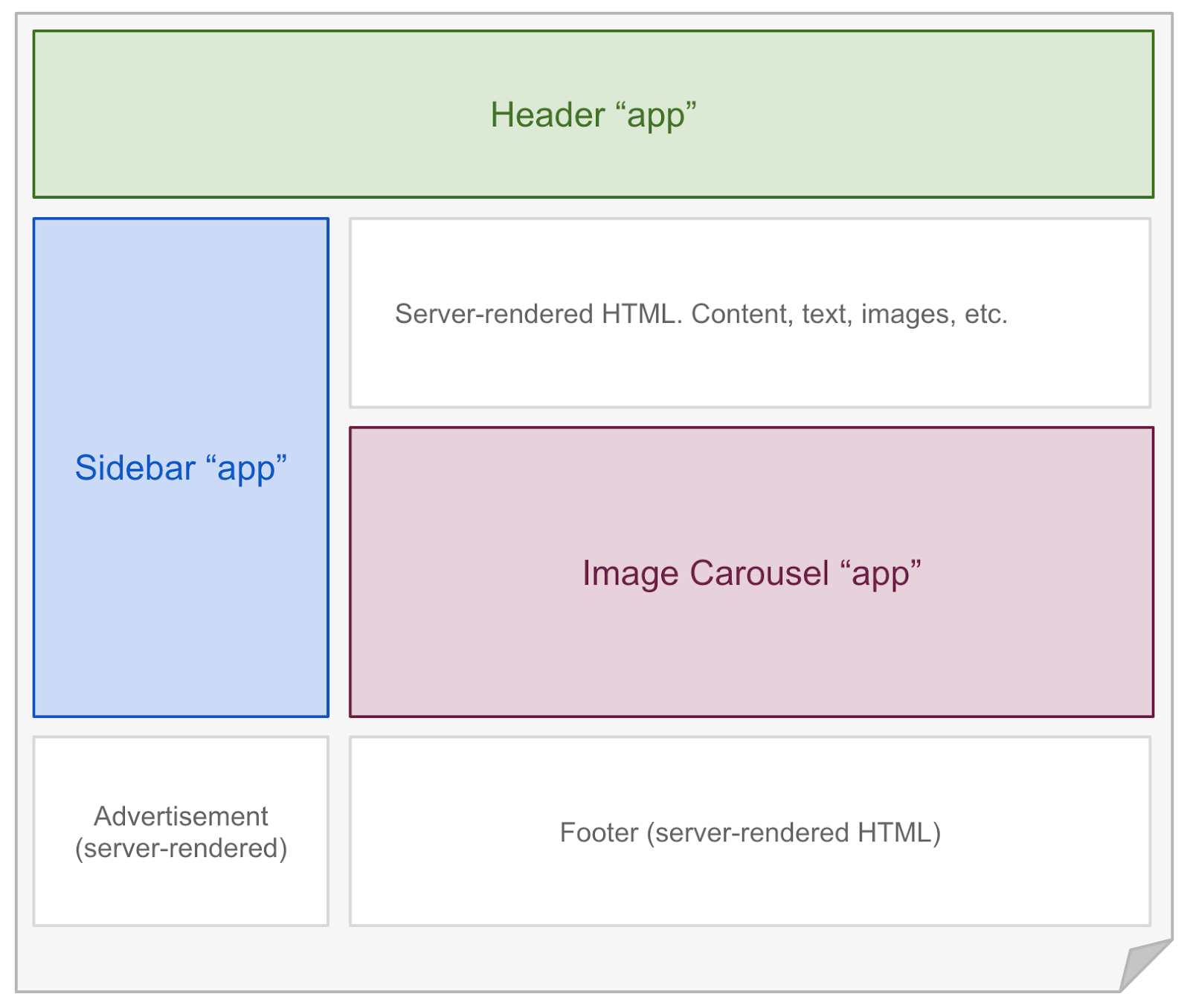 + + + +## Hydrate Interactive Components + +Astro renders every component on the server **at build time**. To hydrate components on the client **at runtime**, you may use any of the following `client:*` directives. A directive is a component attribute (always with a `:`) which tells Astro how your component should be rendered. + +```astro +--- +// Example: hydrating a React component in the browser. +import MyReactComponent from '../components/MyReactComponent.jsx'; +--- +<!-- "client:visible" means the component won't load any client-side + JavaScript until it becomes visible in the user's browser. --> +<MyReactComponent client:visible /> +``` + +### `<MyComponent client:load />` +Hydrate the component on page load. + +### `<MyComponent client:idle />` +Hydrate the component as soon as main thread is free (uses [requestIdleCallback()][mdn-ric]). + +### `<MyComponent client:visible />` +Hydrate the component as soon as the element enters the viewport (uses [IntersectionObserver][mdn-io]). Useful for content lower down on the page. + +### `<MyComponent client:media={QUERY} />` +Hydrate the component as soon as the browser matches the given media query (uses [matchMedia][mdn-mm]). Useful for sidebar toggles, or other elements that should only display on mobile or desktop devices. + +## Can I Hydrate Astro Components? + +[Astro components](./astro-components) (`.astro` files) are HTML-only templating components with no client-side runtime. If you try to hydrate an Astro component with a `client:` modifier, you will get an error. + +To make your Astro component interactive, you will need to convert it to the frontend framework of your choice: React, Svelte, Vue, etc. If you have no preference, we recommend React or Preact as most similar to Astro's syntax. + +Alternatively, you could add a `<script>` tag to your Astro component HTML template and send JavaScript to the browser that way. While this is fine for the simple stuff, we recommend a frontend framework for more complex interactive components. + +[mdn-io]: https://developer.mozilla.org/en-US/docs/Web/API/Intersection_Observer_API +[mdn-ric]: https://developer.mozilla.org/en-US/docs/Web/API/Window/requestIdleCallback diff --git a/docs/src/pages/core-concepts/layouts.md b/docs/src/pages/core-concepts/layouts.md new file mode 100644 index 000000000..5a403b615 --- /dev/null +++ b/docs/src/pages/core-concepts/layouts.md @@ -0,0 +1,155 @@ +--- +layout: ~/layouts/Main.astro +title: Layouts +--- + +**Layouts** are a special type of [Component](/core-concepts/astro-components) that help you share and reuse common page layouts within your project. + +Layouts are just like any other reusable Astro component. There's no new syntax or APIs to learn. However, reusable page layouts are such a common pattern in web development that we created this guide to help you use them. + +## Usage + +Astro layouts support props, slots, and all of the other features of Astro components. Layouts are just normal components, after all! + +Unlike other components, layouts will often contain the full page `<html>`, `<head>` and `<body>` (often referred to as the **page shell**). + +It's a common pattern to put all of your layout components in a single `src/layouts` directory. + +## Example + +```astro +--- +// src/layouts/BaseLayout.astro +const {title} = Astro.props; +--- +<html> + <head> + <title>Example Layout: {title}</title> + </head> + <body> + <!-- Adds a navigation bar to every page. --> + <nav> + <a href="#">Home</a> + <a href="#">Posts</a> + <a href="#">Contact</a> + </nav> + <!-- slot: your page content will be injected here. --> + <slot /> + </body> +</html> +``` + +📚 The `<slot />` element lets Astro components define where any children elements (passed to the layout) should go. Learn more about how `<slot/>` works in our [Astro Component guide.](/core-concepts/astro-components) + +Once you have your first layout, You can use it like you would any other component on your page. Remember that your layout contains your page `<html>`, `<head>`, and `<body>`. You only need to provide the custom page content. + +```astro +--- +// src/pages/index.astro +import BaseLayout from '../layouts/BaseLayout.astro' +--- +<BaseLayout title="Homepage"> + <h1>Hello, world!</h1> + <p>This is my page content. It will be nested inside a layout.</p> +</BaseLayout> +``` + + +## Nesting Layouts + +You can nest layouts when you want to create more specific page types without copy-pasting. It is common in Astro to have one generic `BaseLayout` and then many more specific layouts (`PostLayout`, `ProductLayout`, etc.) that reuse and build on top of it. + + +```astro +--- +// src/layouts/PostLayout.astro +import BaseLayout from '../layouts/BaseLayout.astro' +const {title, author} = Astro.props; +--- + <!-- This layout reuses BaseLayout (see example above): --> +<BaseLayout title={title}> + <!-- Adds new post-specific content to every page. --> + <div>Post author: {author}</div> + <!-- slot: your page content will be injected here. --> + <slot /> +</BaseLayout> +``` + +## Composing Layouts + +Sometimes, you need more granular control over your page. For instance, you may want to add SEO or social `meta` tags on some pages, but not others. You could implement this with a prop on your layout (`<BaseLayout addMeta={true} ...`) but at some point it may be easier to compose your layouts without nesting. + +Instead of defining your entire `<html>` page as one big layout, you can define the `head` and `body` contents as smaller, separate components. This lets you compose multiple layouts together in unique ways on every page. + +```astro +--- +// src/layouts/BaseHead.astro +const {title, description} = Astro.props; +--- +<meta charset="UTF-8"> +<title>{title}</title> +<meta name="description" content={description}> +<link rel="preconnect" href="https://fonts.gstatic.com"> +<link href="https://fonts.googleapis.com/css2?family=Spectral:ital,wght@0,400;0,700;1,400;1,700&display=swap" rel="stylesheet"> +``` + +Notice how this layout doesn't include your page shell, and only includes some generic elements that should go in your `<head>`. This lets you combine multiple layout components together with more control over the overall page structure. + +```astro +--- +// src/pages/index.astro +import BaseHead from '../layouts/BaseHead.astro'; +import OpenGraphMeta from '../layouts/OpenGraphMeta.astro'; +--- +<html> + <head> + <!-- Now, you have complete control over the head, per-page. --> + <BaseHead title="Page Title" description="Page Description" /> + <OpenGraphMeta /> + <!-- You can even add custom, one-off elements as needed. --> + <link rel="alternate" type="application/rss+xml" href="/feed/posts.xml"> + </head> + <body> + <!-- ... --> + </body> +</html> +``` + +The one downside to this approach is that you'll need to define the `<html>`, `<head>`, and `<body>` elements on every page yourself. This is needed to construct the page because the layout components no longer contain the full page shell. + +## Markdown Layouts + +Layouts are essential for Markdown files. Markdown files can declare a layout in the file frontmatter. Each Markdown file will be rendered to HTML and then injected into the layout's `<slot />` location. + +```markdown +--- +title: Blog Post +layout: ../layouts/PostLayout.astro +--- +This blog post will be **rendered** inside of the `<PostLayout />` layout. +``` + +Markdown pages always pass a `content` prop to their layout, which is useful to grab information about the page, title, metadata, table of contents headers, and more. + +``` +--- +// src/layouts/PostLayout.astro +const { content } = Astro.props; +--- +<html> + <head> + <title>{content.title}</title> + </head> + <body> + <h1>{content.title}</h1> + <h2>{content.description}</h2> + <img src={content.image} alt=""> + <article> + <!-- slot: Markdown content goes here! --> + <slot /> + </article> + </body> +</html> +``` + +📚 Learn more about Astro's markdown support in our [Markdown guide](/guides/markdown-content). diff --git a/docs/src/pages/core-concepts/project-structure.md b/docs/src/pages/core-concepts/project-structure.md new file mode 100644 index 000000000..8822a5a91 --- /dev/null +++ b/docs/src/pages/core-concepts/project-structure.md @@ -0,0 +1,56 @@ +--- +layout: ~/layouts/Main.astro +title: Project Structure +--- + +Astro includes an opinionated folder layout for your project. Every Astro project must include these directories and files: + +- `src/*` - Your project source code (components, pages, etc.) +- `public/*` - Your non-code assets (fonts, icons, etc.) +- `package.json` - A project manifest. + +The easiest way to set up your new project is with `npm init astro`. Check out our [Installation Guide](/quick-start) for a walkthrough of how to set up your project automatically (with `npm init astro`) or manually. +## Project Structure + +``` +├── src/ +│ ├── components/ +│ ├── layouts/ +│ └── pages/ +│ └── index.astro +├── public/ +└── package.json +``` + +### `src/` + +The src folder is where most of your project source code lives. This includes: + +- [Astro Components](/core-concepts/astro-components) +- [Pages](/core-concepts/astro-pages) +- [Layouts](/core-concepts/layouts) +- [Frontend JS Components](/core-concepts/component-hydration) +- [Styling (CSS, Sass)](/guides/styling) +- [Markdown](/guides/markdown-content) + +Astro has complete control over how these files get processed, optimized, and bundled in your final site build. Some files (like Astro components) never make it to the browser directly and are instead rendered to HTML. Other files (like CSS) are sent to the browser but may be bundled with other CSS files depending on how your site uses. + +### `src/components` + +[Components](/core-concepts/astro-components) are reusable units of UI for your HTML pages. It is recommended (but not required) that you put your components in this directory. How you organize them within this directory is up to you. + +Your non-Astro UI components (React, Preact, Svelte, Vue, etc.) can also live in the `src/components` directory. Astro will automatically render all components to HTML unless you've enabled a frontend component via partial hydration. + +### `src/layouts` + +[Layouts](/core-concepts/layouts) are reusable components for HTML page layouts. It is recommended (but not required) that you put your layout components in this directory. How you organize them within this directory is up to you. + +### `src/pages` + +[Pages](/core-concepts/astro-pages) contain all pages (`.astro` and `.md` supported) for your website. It is **required** that you put your pages in this directory. + +### `public/` + +For most users, the majority of your files will live inside of the `src/` directory so that Astro can properly handle and optimize them in your final build. By contrast, the `public/` directory is the place for any files to live outside of the Astro build process. + +If you put a file into the public folder, it will not be processed by Astro. Instead it will be copied into the build folder untouched. This can be useful for assets like images and fonts, or when you need to include a specific file like `robots.txt` or `manifest.webmanifest`.
\ No newline at end of file diff --git a/docs/src/pages/examples.md b/docs/src/pages/examples.md new file mode 100644 index 000000000..2ab3f409b --- /dev/null +++ b/docs/src/pages/examples.md @@ -0,0 +1,8 @@ +--- +layout: ~/layouts/Main.astro +title: Examples +--- + +If you prefer to learn by example, check out our [Examples Library](https://github.com/snowpackjs/astro/tree/main/examples) on GitHub. + +<!-- Once we merge astro-docs back into the main repo, we can actually fetch the list of examples at build-time by scanning the examples/ directory! -->
\ No newline at end of file diff --git a/docs/src/pages/guides/data-fetching.md b/docs/src/pages/guides/data-fetching.md new file mode 100644 index 000000000..4f972dd82 --- /dev/null +++ b/docs/src/pages/guides/data-fetching.md @@ -0,0 +1,64 @@ +--- +layout: ~/layouts/Main.astro +title: Data Fetching +--- + +Astro components and pages can fetch remote data to help generate your pages. Astro provides two different tools to pages to help you do this: **fetch()** and **top-level await.** + +## `fetch()` + +Astro pages have access to the global `fetch()` function in their setup script. `fetch()` is a native JavaScript API ([MDN](https://developer.mozilla.org/en-US/docs/Web/API/Fetch_API/Using_Fetch)) that lets you make HTTP requests for things like APIs and resources. + +Even though Astro component scripts run inside of Node.js (and not in the browser) Astro provides this native API so that you can fetch data at page build time. + +```astro +--- +// Movies.astro +const response = await fetch('https://example.com/movies.json'); +const data = await response.json(); +// Remember: Astro component scripts log to the CLI +console.log(data); +--- +<!-- Output the result to the page --> +<div>{JSON.stringify(data)}</div> +``` + +## Top-level await + +`await` is another native JavaScript feature that lets you await the response of some asynchronous promise ([MDN](https://developer.mozilla.org/en-US/docs/Web/JavaScript/Reference/Operators/await)). Astro supports `await` in the top-level of your component script. + +**Important:** These are not yet available inside of non-page Astro components. Instead, do all of your data loading inside of your pages, and then pass them to your components as props. + +## Using `fetch()` outside of Astro Components + +If you want to use `fetch()` in a non-astro component, use the [`node-fetch`](https://github.com/node-fetch/node-fetch) library: + +```tsx +// Movies.tsx +import fetch from 'node-fetch'; +import type { FunctionalComponent } from 'preact'; +import { h } from 'preact'; + +const data = fetch('https://example.com/movies.json').then((response) => + response.json() +); + +// Components that are build-time rendered also log to the CLI. +// If you loaded this component with a directive, it would log to the browser console. +console.log(data); + +const Movies: FunctionalComponent = () => { + // Output the result to the page + return <div>{JSON.stringify(data)}</div>; +}; + +export default Movies; +``` + +If you load a component using `node-fetch` [interactively](/core-concepts/component-hydration), with `client:load`, `client:visible`, etc., you'll need to either not use `node-fetch` or switch to an [isomorphic](https://en.wikipedia.org/wiki/Isomorphic_JavaScript) library that will run both at build time and on the client, as the [`node-fetch` README.md](https://github.com/node-fetch/node-fetch#motivation) reccomends: + +> Instead of implementing XMLHttpRequest in Node.js to run browser-specific [Fetch polyfill](https://github.com/github/fetch), why not go from native http to fetch API directly? Hence, node-fetch, minimal code for a window.fetch compatible API on Node.js runtime. +> +> See Jason Miller's [isomorphic-unfetch](https://www.npmjs.com/package/isomorphic-unfetch) or Leonardo Quixada's [cross-fetch](https://github.com/lquixada/cross-fetch) for isomorphic usage (exports node-fetch for server-side, whatwg-fetch for client-side). + +> Quoted from https://github.com/node-fetch/node-fetch#motivation diff --git a/docs/src/pages/guides/deploy.md b/docs/src/pages/guides/deploy.md new file mode 100644 index 000000000..9bca1d56d --- /dev/null +++ b/docs/src/pages/guides/deploy.md @@ -0,0 +1,256 @@ +--- +layout: ~/layouts/Main.astro +title: Deploy a Website +--- + +> This page is based off of [Vite's](https://vitejs.dev/) well-documented [static deploy instructions](https://vitejs.dev/guide/static-deploy.html). + +The following guides are based on some shared assumptions: + +- You are using the default build output location (`dist/`). This location [can be changed using the `dist` configuration option](/reference/configuration-reference). +- You are using npm. You can use equivalent commands to run the scripts if you are using Yarn or other package managers. +- Astro is installed as a local dev dependency in your project, and you have setup the following npm scripts: + +```json +{ + "scripts": { + "start": "astro dev", + "build": "astro build" + } +} +``` + + + +## Building The App + +You may run `npm run build` command to build the app. + +```bash +$ npm run build +``` + +By default, the build output will be placed at `dist/`. You may deploy this `dist/` folder to any of your preferred platforms. + +## GitHub Pages + +1. Set the correct `buildOptions.site` in `astro.config.js`. +2. Run `touch public/.nojekyll` to create a `.nojekyll` file in `public/`. This [bypasses GitHub Page's default behavior](https://github.blog/2009-12-29-bypassing-jekyll-on-github-pages/) to ignore paths prefixed with `_`. +3. Inside your project, create `deploy.sh` with the following content (uncommenting the appropriate lines), and run it to deploy: + + ```bash{13,20,23} + #!/usr/bin/env sh + + # abort on errors + set -e + + # build + npm run build + + # navigate into the build output directory + cd dist + + # if you are deploying to a custom domain + # echo 'www.example.com' > CNAME + + git init + git add -A + git commit -m 'deploy' + + # if you are deploying to https://<USERNAME>.github.io + # git push -f git@github.com:<USERNAME>/<USERNAME>.github.io.git main + + # if you are deploying to https://<USERNAME>.github.io/<REPO> + # git push -f git@github.com:<USERNAME>/<REPO>.git main:gh-pages + + cd - + ``` +> You can also run the above script in your CI setup to enable automatic deployment on each push. + +### GitHub Actions + +TODO: We'd love an example action snippet to share here! + +### Travis CI + +1. Set the correct `buildOptions.site` in `astro.config.js`. +2. Create a file named `.travis.yml` in the root of your project. +3. Run `npm install` locally and commit the generated lockfile (`package-lock.json`). +4. Use the GitHub Pages deploy provider template, and follow the [Travis CI documentation](https://docs.travis-ci.com/user/deployment/pages/). + + ```yaml + language: node_js + node_js: + - lts/* + install: + - npm ci + script: + - npm run build + deploy: + provider: pages + skip_cleanup: true + local_dir: dist + # A token generated on GitHub allowing Travis to push code on you repository. + # Set in the Travis settings page of your repository, as a secure variable. + github_token: $GITHUB_TOKEN + keep_history: true + on: + branch: master + ``` + +## GitLab Pages + +1. Set the correct `buildOptions.site` in `astro.config.js`. +2. Set `build.outDir` in `astro.config.js` to `public`. +3. Create a file called `.gitlab-ci.yml` in the root of your project with the content below. This will build and deploy your site whenever you make changes to your content: + + ```yaml + image: node:10.22.0 + pages: + cache: + paths: + - node_modules/ + script: + - npm install + - npm run build + artifacts: + paths: + - public + only: + - master + ``` + +## Netlify + +In your codebase, make sure you have a `.nvmrc` file with `v14.15.1` in it. + +You can configure your deploy in two ways, via the Netlify website or with the `netlify.toml` file. + +With the `netlify.toml` file, add it at the top level of your project with the following settings: + +```toml +[build] + command = "npm run build" + publish = "dist" +``` + +Then, set up a new project on [Netlify](https://netlify.com) from your chosen Git provider. + +If you don't want to use the `netlify.toml`, when you go to [Netlify](https://netlify.com) and set up up a new project from Git, input the following settings: + + - **Build Command:** `astro build` or `npm run build` + - **Publish directory:** `dist` + +Then hit the deploy button. + +## Google Firebase + +1. Make sure you have [firebase-tools](https://www.npmjs.com/package/firebase-tools) installed. + +2. Create `firebase.json` and `.firebaserc` at the root of your project with the following content: + + `firebase.json`: + + ```json + { + "hosting": { + "public": "dist", + "ignore": [] + } + } + ``` + + `.firebaserc`: + + ```js + { + "projects": { + "default": "<YOUR_FIREBASE_ID>" + } + } + ``` + +3. After running `npm run build`, deploy using the command `firebase deploy`. + +## Surge + +1. First install [surge](https://www.npmjs.com/package/surge), if you haven’t already. + +2. Run `npm run build`. + +3. Deploy to surge by typing `surge dist`. + +You can also deploy to a [custom domain](http://surge.sh/help/adding-a-custom-domain) by adding `surge dist yourdomain.com`. + +## Heroku + +1. Install [Heroku CLI](https://devcenter.heroku.com/articles/heroku-cli). + +2. Create a Heroku account by [signing up](https://signup.heroku.com). + +3. Run `heroku login` and fill in your Heroku credentials: + + ```bash + $ heroku login + ``` + +4. Create a file called `static.json` in the root of your project with the below content: + + `static.json`: + + ```json + { + "root": "./dist" + } + ``` + + This is the configuration of your site; read more at [heroku-buildpack-static](https://github.com/heroku/heroku-buildpack-static). + +5. Set up your Heroku git remote: + + ```bash + # version change + $ git init + $ git add . + $ git commit -m "My site ready for deployment." + + # creates a new app with a specified name + $ heroku apps:create example + + # set buildpack for static sites + $ heroku buildpacks:set https://github.com/heroku/heroku-buildpack-static.git + ``` + +6. Deploy your site: + + ```bash + # publish site + $ git push heroku master + + # opens a browser to view the Dashboard version of Heroku CI + $ heroku open + ``` + +## Vercel + +To deploy your Astro project with a [Vercel for Git](https://vercel.com/docs/git), make sure it has been pushed to a Git repository. + +Go to https://vercel.com/import/git and import the project into Vercel using your Git of choice (GitHub, GitLab or BitBucket). Follow the wizard to select the project root with the project's `package.json` and override the build step using `npm run build` and the output dir to be `./dist` + +After your project has been imported, all subsequent pushes to branches will generate Preview Deployments, and all changes made to the Production Branch (commonly "main") will result in a Production Deployment. + +Once deployed, you will get a URL to see your app live, such as the following: https://astro.vercel.app + +## Azure Static Web Apps + +You can deploy your Astro project with Microsoft Azure [Static Web Apps](https://aka.ms/staticwebapps) service. You need: + +- An Azure account and a subscription key. You can create a [free Azure account here](https://azure.microsoft.com/free). +- Your app code pushed to [GitHub](https://github.com). +- The [SWA Extension](https://marketplace.visualstudio.com/items?itemName=ms-azuretools.vscode-azurestaticwebapps) in [Visual Studio Code](https://code.visualstudio.com). + +Install the extension in VS Code and navigate to your app root. Open the Static Web Apps extension, sign in to Azure, and click the '+' sign to create a new Static Web App. You will be prompted to designate which subscription key to use. + +Follow the wizard started by the extension to give your app a name, choose a framework preset, and designate the app root (usually `/`) and built file location `/dist`. The wizard will run and will create a GitHub action in your repo in a `.github` folder. + +The action will work to deploy your app (watch its progress in your repo's Actions tab) and, when successfully completed, you can view your app in the address provided in the extension's progress window by clicking the 'Browse Website' button that appears when the GitHub action has run. diff --git a/docs/src/pages/guides/imports.md b/docs/src/pages/guides/imports.md new file mode 100644 index 000000000..595f13e62 --- /dev/null +++ b/docs/src/pages/guides/imports.md @@ -0,0 +1,139 @@ +--- +layout: ~/layouts/Main.astro +title: Supported Imports +--- + +Astro uses Snowpack as its internal build system. Snowpack provides Astro with built-in support for the following file types, with no configuration required: + +- JavaScript (`.js`, `.mjs`) +- TypeScript (`.ts`, `.tsx`) +- JSON (`.json`) +- JSX (`.jsx`, `.tsx`) +- CSS (`.css`) +- CSS Modules (`.module.css`) +- Images & Assets (`.svg`, `.jpg`, `.png`, etc.) +- Astro Components (`.astro`) +- Markdown (`.md`) +- WASM (`.wasm`) + +Any files in your `public/` directory are copied into the final build, untouched by Snowpack or Astro. The following applies to files in your `src/` directory, which Astro is ultimately responsible for. + +## JavaScript & ESM + +Astro was designed for JavaScript's native ES Module (ESM) syntax. ESM lets you define explicit imports & exports that browsers and build tools can better understand and optimize for. If you're familiar with the `import` and `export` keywords in JavaScript, then you already know ESM! + +```js +// ESM Example - src/user.js +export function getUser() { + /* ... */ +} + +// src/index.js +import {getUser} from './user.js'; +``` + +All browsers now support ESM, so Astro is able to ship this code directly to the browser during development. + +## TypeScript + +Astro includes built-in support to build TypeScript files (`*.ts`) to JavaScript. Astro components also support TypeScript in the frontmatter script section. + +Note that this built-in support is build only. By default, Astro does not type-check your TypeScript code. + +<!-- To integrate type checking into your development/build workflow, add the [@snowpack/plugin-typescript](https://www.npmjs.com/package/@snowpack/plugin-typescript) plugin. --> + +## JSX + +Astro includes built-in support to build JSX files (`*.jsx` & `*.tsx`) to JavaScript. + +If you are using Preact, Astro will detect your Preact import and switch to use the Preact-style JSX `h()` function. This is all done automatically for you. + +**Note: Astro does not support JSX in `.js`/`.ts` files.** + +## JSON + +```js +// Load the JSON object via the default export +import json from './data.json'; +``` + +Astro supports importing JSON files directly into your application. Imported files return the full JSON object in the default import. + +## CSS + +```js +// Load and inject 'style.css' onto the page +import './style.css'; +``` + +Astro supports importing CSS files directly into your application. Imported styles expose no exports, but importing one will automatically add those styles to the page. This works for all CSS files by default, and can support compile-to-CSS languages like Sass & Less via plugins. + +If you prefer not to write CSS, Astro also supports all popular CSS-in-JS libraries (ex: styled-components) for styling. + +## CSS Modules + +```js +// 1. Converts './style.module.css' classnames to unique, scoped values. +// 2. Returns an object mapping the original classnames to their final, scoped value. +import styles from './style.module.css'; + +// This example uses JSX, but you can use CSS Modules with any framework. +return <div className={styles.error}>Your Error Message</div>; +``` + +Astro supports CSS Modules using the `[name].module.css` naming convention. Like any CSS file, importing one will automatically apply that CSS to the page. However, CSS Modules export a special default `styles` object that maps your original classnames to unique identifiers. + +CSS Modules help you enforce component scoping & isolation on the frontend with unique-generated class names for your stylesheets. + +## Other Assets + +```jsx +import imgReference from './image.png'; // img === '/src/image.png' +import svgReference from './image.svg'; // svg === '/src/image.svg' +import txtReference from './words.txt'; // txt === '/src/words.txt' + +// This example uses JSX, but you can use import references with any framework. +<img src={imgReference} />; +``` + +All other assets not explicitly mentioned above can be imported via ESM `import` and will return a URL reference to the final built asset. This can be useful for referencing non-JS assets by URL, like creating an image element with a `src` attribute pointing to that image. + +## WASM + +```js +// Loads and intializes the requested WASM file +const wasm = await WebAssembly.instantiateStreaming(fetch('/example.wasm')); +``` + +Astro supports loading WASM files directly into your application using the browser's [`WebAssembly`](https://developer.mozilla.org/en-US/docs/Web/JavaScript/Reference/Global_Objects/WebAssembly) API. Read our [WASM guide](/guides/wasm) to learn more. + +## NPM Packages + +```js +// Returns the React & React-DOM npm packages +import React from 'react'; +import ReactDOM from 'react-dom'; +``` + +Astro lets you import npm packages directly in the browser. Even if a package was published using a legacy format, Astro will up-convert the package to ESM before serving it to the browser. + +When you start up your dev server or run a new build, you may see a message that Snowpack is "installing dependencies". This means that Snowpack is converting your dependencies to run in the browser. This needs to run only once, or until you next change your dependency tree by adding or removing dependencies. + +## Node Builtins + +We encourage Astro users to avoid Node.js builtins (`fs`, `path`, etc) whenever possible. Astro aims to be compatible with multiple JavaScript runtimes in the future. This includes [Deno](https://deno.land/) and [Cloudflare Workers](https://workers.cloudflare.com/) which do not support Node builtin modules such as `fs`. + +Our aim is to provide Astro alternatives to common Node.js builtins. However, no such alternatives exist today. So, if you _really_ need to use these builtin modules we don't want to stop you. Astro supports Node.js builtins using Node's newer `node:` prefix. If you want to read a file, for example, you can do so like this: + +```jsx +--- +// Example: import the "fs/promises" builtin from Node.js +import fs from 'node:fs/promises'; + +const url = new URL('../../package.json', import.meta.url); +const json = await fs.readFile(url, 'utf-8'); +const data = JSON.parse(json); +--- + +<span>Version: {data.version}</span> +``` diff --git a/docs/src/pages/guides/markdown-content.md b/docs/src/pages/guides/markdown-content.md new file mode 100644 index 000000000..1314e9ea8 --- /dev/null +++ b/docs/src/pages/guides/markdown-content.md @@ -0,0 +1,222 @@ +--- +layout: ~/layouts/Main.astro +title: Markdown +--- + +Astro comes with out-of-the-box Markdown support powered by the expansive [remark](https://remark.js.org/) ecosystem. + +## Remark and Rehype Plugins + +In addition to custom components inside the [`<Markdown>` component](/guides/markdown-content#markdown-component), Astro comes with [GitHub-flavored Markdown](https://github.github.com/gfm/) support, [Footnotes](https://github.com/remarkjs/remark-footnotes) syntax, [Smartypants](https://github.com/silvenon/remark-smartypants), and syntax highlighting via [Prism](https://prismjs.com/) pre-enabled. + +Also, Astro supports third-party plugins for Markdown. You can provide your plugins in `astro.config.mjs`. + +> **Note:** Enabling custom `remarkPlugins` or `rehypePlugins` removes Astro's built-in support for [GitHub-flavored Markdown](https://github.github.com/gfm/) support, [Footnotes](https://github.com/remarkjs/remark-footnotes) syntax, [Smartypants](https://github.com/silvenon/remark-smartypants). You must explicitly add these plugins to your `astro.config.mjs` file, if desired. + +## Add a markdown plugin in Astro + +If you want to add a plugin, you need to install the npm package dependency in your project and then update the `markdownOptions.remarkPlugins` or `markdownOptions.rehypePlugins` depends on what plugin you want to have: + +```js +// astro.config.js +export default { + markdownOptions: { + remarkPlugins: [ + // Add a Remark plugin that you want to enable for your project. + // If you need to provide options for the plugin, you can use an array and put the options as the second item. + // 'remark-slug', + // ['remark-autolink-headings', { behavior: 'prepend'}], + ] + rehypePlugins: [ + // Add a Rehype plugin that you want to enable for your project. + // If you need to provide options for the plugin, you can use an array and put the options as the second item. + // 'rehype-slug', + // ['rehype-autolink-headings', { behavior: 'prepend'}], + ] + }, +}; +``` + +You can provide names of the plugins as well as import them: + +```js +// astro.config.js +export default { + markdownOptions: { + remarkPlugins: [import('remark-slug'), [import('remark-autolink-headings'), { behavior: 'prepend' }]], + }, +}; +``` + +### Markdown Pages + +Astro treats any `.md` files inside of the `/src/pages` directory as pages. These pages are processed as plain markdown files and do not support components. If you're looking to embed rich components in your markdown, take a look at the [Markdown Component](#astros-markdown-component) section. + +`layout` + +The only special Frontmatter key is `layout`, which defines the relative path to an `.astro` component which should wrap your Markdown content. + +`src/pages/index.md` + +```jsx +--- +layout: ../layouts/main.astro +--- + +# Hello World! +``` + +Layout files are normal `.astro` components. Any Frontmatter defined in your `.md` page will be exposed to the Layout component as the `content` prop. `content` also has an `astro` key which holds special metadata about your file, like the complete Markdown `source` and a `headings` object. + +Keep in mind that the only guaranteed variables coming from the `content` prop object are `astro` and `url`. An example of what a blog post `content` object might look like is as follows: + +```json +{ + /** Frontmatter from blog post + "title": "", + "date": "", + "author": "", + "description": "", + **/ + "astro": { + "headers": [], + "source": "" + }, + "url": "" +} +``` + +The rendered Markdown content is placed into the default `<slot />` element. + +`src/layouts/main.astro` + +```jsx +--- +const { content } = Astro.props; +--- + +<html> + <head> + <title>{content.title}</title> + </head> + + <body> + <slot/> + </body> +</html> +``` + +### Astro's Markdown Component + +Astro has a dedicated component used to let you render your markdown as HTML components. This is a special component that is only exposed to `.astro` files. To use the `<Markdown>` component, within yout frontmatter block use the following import statement: + +```jsx +--- +import { Markdown } from 'astro/components'; +--- +``` + +You can utilize this within your `.astro` file by doing the following: + +```jsx +--- +import { Markdown } from 'astro/components'; +--- + +<Layout> + <Markdown> + # Hello world! + + The contents inside here is all in markdown. + </Markdown> +</Layout> +``` + +`<Markdown>` components provide more flexibility and allow you to use plain HTML or custom components. For example: + +````jsx +--- +// For now, this import _must_ be named "Markdown" and _must not_ be wrapped with a custom component +// We're working on easing these restrictions! +import { Markdown } from 'astro/components'; +import Layout from '../layouts/main.astro'; +import MyFancyCodePreview from '../components/MyFancyCodePreview.tsx'; + +const expressions = 'Lorem ipsum'; +--- + +<Layout> + <Markdown> + # Hello world! + + **Everything** supported in a `.md` file is also supported here! + + There is _zero_ runtime overhead. + + In addition, Astro supports: + - Astro {expressions} + - Automatic indentation normalization + - Automatic escaping of expressions inside code blocks + + ```jsx + // This content is not transformed! + const object = { someOtherValue }; + ``` + + - Rich component support like any `.astro` file! + - Recursive Markdown support (Component children are also processed as Markdown) + + <MyFancyCodePreview client:visible> + ```jsx + const object = { someOtherValue }; + ``` + </MyFancyCodePreview client:visible> + </Markdown> +</Layout> +```` + +### Remote Markdown + +If you have Markdown in a remote source, you may pass it directly to the Markdown component through the `content` attribute. For example, the example below fetches the README from Snowpack's Github repository and renders it as HTML. + +```jsx +--- +import { Markdown } from 'astro/components'; + +const content = await fetch('https://raw.githubusercontent.com/snowpackjs/snowpack/main/README.md').then(res => res.text()); +--- + +<Layout> + <Markdown content={content} /> +</Layout> +``` + +There might be times when you want to combine both dynamic, and static markdown. If that is the case, you can nest `<Markdown>` components with each other to get the best of both worlds. + +```jsx +--- +import { Markdown } from 'astro/components'; + +const content = await fetch('https://raw.githubusercontent.com/snowpackjs/snowpack/main/README.md').then(res => res.text()); +--- + +<Layout> + <Markdown> + ## Markdown example + + Here we have some __Markdown__ code. We can also dynamically render content from remote places. + + <Markdown content={content} /> + </Mardown> +</Layout> +``` + +### Security FAQs + +**Aren't there security concerns to rendering remote markdown directly to HTML?** + +Yes! Just like with regular HTML, improper use of the `Markdown` component can open you up to a [cross-site scripting (XSS)](https://en.wikipedia.org/wiki/Cross-site_scripting) attack. If you are rendering untrusted content, be sure to _sanitize your content **before** rendering it_. + +**Why not use a prop like React's `dangerouslySetInnerHTML={{ __html: content }}`?** + +Rendering a string of HTML (or Markdown) is an extremely common use case when rendering a static site and you probably don't need the extra hoops to jump through. Rendering untrusted content is always dangerous! Be sure to _sanitize your content **before** rendering it_. diff --git a/docs/src/pages/guides/publish-to-npm.md b/docs/src/pages/guides/publish-to-npm.md new file mode 100644 index 000000000..aebf0311a --- /dev/null +++ b/docs/src/pages/guides/publish-to-npm.md @@ -0,0 +1,83 @@ +--- +layout: ~/layouts/Main.astro +title: Publish a Component to NPM +--- + +Built a great Astro component? **Publish it to [npm!](https://npmjs.com/)** + +Once published to npm, Astro components can be installed and used in your project like any other npm package. npm is a great way to share Astro components across projects within your team, your company, or the entire world. + +## Basic NPM Package Setup + +Here's an example package that we'd like to publish to npm. It includes two Astro components and a few other files. + +``` +/my-components-package/ +├── package.json +├── index.js +├── Capitalize.astro +└── Bold.astro +``` + +### `package.json` + +Your package manifest. This includes information about your package such as name, description, any dependencies, and other important metadata. If you don't know what the `package.json` file is, we highly recommend you to have a quick read on [the npm documentation](https://docs.npmjs.com/creating-a-package-json-file). + +We recommend that you define an [exports entry](https://nodejs.org/api/packages.html) for your `index.js` package entrypoint like so: + +```json +{ + "name": "@example/my-components", + "version": "0.0.1", + "exports": "./index.js" +} +``` + +### `index.js` + +`index.js` is your package entrypoint, which is the file that gets loaded when someone imports your package by name. Having a JavaScript file as your package entrypoint will let you export multiple components and have better control over their exported component names. + +```js +export { default as Capitalize } from './Capitalize.astro'; +export { default as Bold } from './Bold.astro'; +``` + +### Publishing + +Once you have your package ready, you can publish it to npm by running the command `npm publish`. If that fails, make sure that you've logged in via `npm login` and that your package.json is correct. + +Once published, anyone will be able to install your components and then import them like so: + +```astro +--- +import { Bold, Capitalize } from '@example/my-components'; +--- +<Capitalize phrase={`Hello world`} /> +``` + +## Advanced + +We recommend a single `index.js` package entrypoint because this is what most users are familar with. However, in some rare scenarios you may want to have your users import each `.astro` component directly, in the same manner that you import `.astro` files in your own project. + +```astro +--- +import Capitalize from '@example/my-components/Capitalize.astro'; +--- +<Capitalize phrase={`Hello world`} /> +``` + +This is a less common scenario, and we only recommend it if you have good reason. Because Astro is completely rendered at build-time, there are no client-side performance concerns to our default recommendation to export your components from a single `index.js` file. + +To support importing by file within your package, add each file to your **package.json** `exports` map: + +```diff +{ + "name": "@example/my-components", + "version": "1.0.0", + "exports": { +- ".": "./index.js", ++ "./Bold.astro": "./Bold.astro", ++ "./Capitalize.astro": "./Capitalize.astro" + } +} +```
\ No newline at end of file diff --git a/docs/src/pages/guides/styling.md b/docs/src/pages/guides/styling.md new file mode 100644 index 000000000..74308eb16 --- /dev/null +++ b/docs/src/pages/guides/styling.md @@ -0,0 +1,511 @@ +--- +layout: ~/layouts/Main.astro +title: Styling & CSS +--- + +Astro includes special handling to make writing CSS as easy as possible. Styling inside of Astro components is done by adding a `<style>` tag anywhere. + +By default, all Astro component styles are **scoped**, meaning they only apply to the current component. These styles are automatically extracted and optimized for you in the final build, so that you don't need to worry about style loading. + +To create global styles, add a `:global()` wrapper around a selector (the same as if you were using [CSS Modules][css-modules]). + +```html +<!-- src/components/MyComponent.astro --> +<style> + /* Scoped class selector within the component */ + .scoped { + font-weight: bold; + } + /* Scoped element selector within the component */ + h1 { + color: red; + } + /* Global style */ + :global(h1) { + font-size: 32px; + } +</style> + +<div class="scoped">I’m a scoped style and only apply to this component</div> +<h1>I have both scoped and global styles</h1> +``` + +📚 Read our full guide on [Astro component syntax](/core-concepts/astro-components#css-styles) to learn more about using the `<style>` tag. + +## Cross-Browser Compatibility + +We also automatically add browser prefixes using [Autoprefixer][autoprefixer]. By default, Astro loads the [Browserslist defaults][browserslist-defaults], but you may also specify your own by placing a [Browserslist][browserslist] file in your project root. + +--- + +## Supported Styling Options + +Styling in Astro is meant to be as flexible as you’d like it to be! The following options are all supported: + +| Framework | Global CSS | Scoped CSS | CSS Modules | +| :--------------- | :--------: | :--------: | :---------: | +| `.astro` | ✅ | ✅ | N/A¹ | +| `.jsx` \| `.tsx` | ✅ | ❌ | ✅ | +| `.vue` | ✅ | ✅ | ✅ | +| `.svelte` | ✅ | ✅ | ❌ | + +¹ _`.astro` files have no runtime, therefore Scoped CSS takes the place of CSS Modules (styles are still scoped to components, but don’t need dynamic values)_ + +All styles in Astro are automatically [**autoprefixed**](#cross-browser-compatibility) and optimized, so you can just write CSS and we’ll handle the rest ✨. + +--- + +## Frameworks and Libraries + +### 📘 React / Preact + +`.jsx` files support both global CSS and CSS Modules. To enable the latter, use the `.module.css` extension (or `.module.scss`/`.module.sass` if using Sass). + +```js +import './global.css'; // include global CSS +import Styles from './styles.module.css'; // Use CSS Modules (must end in `.module.css`, `.module.scss`, or `.module.sass`!) +``` + +### 📗 Vue + +Vue in Astro supports the same methods as `vue-loader` does: + +- [Scoped CSS][vue-scoped] +- [CSS Modules][vue-css-modules] + +### 📕 Svelte + +Svelte in Astro also works exactly as expected: [Svelte Styling Docs][svelte-style]. + +### 👓 Sass + +Astro also supports [Sass][sass] out-of-the-box. To enable for each framework: + +- **Astro**: `<style lang="scss">` or `<style lang="sass">` +- **React** / **Preact**: `import Styles from './styles.module.scss'`; +- **Vue**: `<style lang="scss">` or `<style lang="sass">` +- **Svelte**: `<style lang="scss">` or `<style lang="sass">` + +💁 Sass is great! If you haven’t used Sass in a while, please give it another try. The new and improved [Sass Modules][sass-use] are a great fit with modern web development, and it’s blazing-fast since being rewritten in Dart. And the best part? **You know it already!** Use `.scss` to write familiar CSS syntax you’re used to, and only sprinkle in Sass features if/when you need them. + +### 🍃 Tailwind + +Astro can be configured to use [Tailwind][tailwind] easily! Install the dependencies: + +``` +npm install --save-dev tailwindcss +``` + +And also create a `tailwind.config.js` in your project root: + +```js +// tailwind.config.js +module.exports = { + mode: 'jit', + purge: ['./public/**/*.html', './src/**/*.{astro,js,jsx,ts,tsx,vue}'], + // more options here +}; +``` + +Be sure to add the config path to `astro.config.mjs`, so that Astro enables JIT support in the dev server. + +```diff + // astro.config.mjs + export default { ++ devOptions: { ++ tailwindConfig: './tailwind.config.js', ++ }, + }; +``` + +Now you’re ready to write Tailwind! Our recommended approach is to create a `public/global.css` file (or whatever you‘d like to name your global stylesheet) with [Tailwind utilities][tailwind-utilities] like so: + +```css +/* public/global.css */ +@tailwind base; +@tailwind components; +@tailwind utilities; +``` + +As an alternative to `public/global.css`, You may also add Tailwind utilities to individual `pages/*.astro` components in `<style>` tags, but be mindful of duplication! If you end up creating multiple Tailwind-managed stylesheets for your site, make sure you’re not sending the same CSS to users over and over again in separate CSS files. + +### Importing from npm + +If you want to import third-party libraries into an Astro component, you can use a `<style lang="scss">` tag to enable [Sass][sass] and use the [@use][sass-use] rule. + +```html +<!-- Loads Boostrap --> +<style lang="scss"> + @use "bootstrap/scss/bootstrap"; +</style> +``` + +## Bundling + +All CSS is minified and bundled automatically for you in running `astro build`. Without getting too in the weeds, the general rules are: + +- If a style only appears on one route, it’s only loaded for that route (`/_astro/[page]-[hash].css`) +- If a style appears on multiple routes, it’s deduplicated into a `/_astro/common-[hash].css` bundle +- All styles are hashed according to their contents (the hashes only change if the contents do!) + +We’ll be expanding our styling optimization story over time, and would love your feedback! If `astro build` generates unexpected styles, or if you can think of improvements, [please open an issue][issues]. + +_Note: be mindful when some page styles get extracted to the ”common” bundle, and some page styles stay on-page. For most people this may not pose an issue, but when part of your styles are bundled they technically may load in a different order and your cascade may be different. While problem isn’t unique to Astro and is present in almost any CSS bundling process, it can be unexpected if you’re not anticipating it. Be sure to inspect your final production build, and please [report any issues][issues] you may come across._ + +## Advanced Styling Architecture + +Too many development setups take a hands-off approach to CSS, or at most leave you with only contrived examples that don’t get you very far. Telling developers “Use whatever styling solution you want!” is a nice thought that rarely works out in practice. Few styling approaches lend themselves to every setup. Astro is no different—certain styling approaches _will_ work better than others. + +An example to illustrate this: Astro removes runtime JS (even the core framework if possible). Thus, depending on Styled Components for all your styles would be bad, as that would require React to load on pages where it’s not needed. Or at best, you’d get a “[FOUC][fouc]” as your static HTML is served but the user waits for JavaScript to download and execute. Or consider a second example at the opposite end of the spectrum: _BEM_. You _can_ use a completely-decoupled [BEM][bem] or [SMACSS][smacss] approach in Astro. But that’s a lot of manual maintenance you can avoid, and it leaves out a lof of convenience of [Astro components](/core-concepts/astro-components). + +We think there’s a great middle ground between intuitive-but-slow CSS-in-JS and fast-but-cumbersome global CSS: **Hybrid Scoped + Utility CSS**. This approach works well in Astro, is performant for users, and will be the best styling solution in Astro _for most people_ (provided you’re willing to learn a little). So as a quick recap: + +**This approach is good for…** + +- Developers wanting to try out something new in regard to styling +- Developers that would appreciate some strong opinions in CSS architecture + +**This approach is **NOT** good for…** + +- Developers that already have strong opinions on styling, and want to control everything themselves + +Read on if you’re looking for some strong opinions 🙂. We’ll describe the approach by enforcing a few key rules that should govern how you set your styles: + +### Hybrid Scoped + Utility CSS + +#### Scoped styles + +You don’t need an explanation on component-based design. You already know that reusing components is a good idea. And it’s this idea that got people used to concepts like [Styled Components][styled-components] and [Styled JSX][styled-jsx]. But rather than burden your users with slow load times of CSS-in-JS, Astro has something better: **built-in scoped styles.** + +```jsx +--- +// src/components/Button.astro --> +--- +<style lang="scss"> + /* ✅ Locally scoped! */ + .btn { + padding: 0.5em 1em; + border-radius: 3px; + font-weight: 700; + } +</style> +<button type="button" class="btn"> + <slot></slot> +</button> +``` + +_Note: all the examples here use `lang="scss"` which is a great convenience for nesting, and sharing [colors and variables][sass-use], but it’s entirely optional and you may use normal CSS if you wish._ + +That `.btn` class is scoped within that component, and won’t leak out. It means that you can **focus on styling and not naming.** Local-first approach fits in very well with Astro’s ESM-powered design, favoring encapsulation and reusability over global scope. While this is a simple example, it should be noted that **this scales incredibly well.** And if you need to share common values between components, [Sass’ module system][sass-use] also gets our recommendation for being easy to use, and a great fit with component-first design. + +By contrast, Astro does allow global styles via the `:global()` escape hatch, however, this should be avoided if possible. To illustrate this: say you used your button in a `<Nav />` component, and you wanted to style it differently there. You might be tempted to have something like: + +```jsx +--- +// src/components/Nav.astro +import Button from './Button.astro'; +--- + +<style lang="scss"> + .nav :global(.btn) { + /* ❌ This will fight with <Button>’s styles */ + } +</style> + +<nav class="nav"> + <Button>Menu</Button> +</nav> +``` + +This is undesirable because now `<Nav>` and `<Button>` fight over what the final button looks like. Now, whenever you edit one, you’ll always have to edit the other, and they are no longer truly isolated as they once were (now coupled by a bidirectional styling dependency). It’s easy to see how this pattern only has to repeated a couple times before being afraid that touching any styles _anywhere_ may break styling in a completely different part of the app (queue `peter-griffin-css-blinds.gif`). + +Instead, let `<Button>` control its own styles, and try a prop: + +```jsx +--- +// src/components/Button.astro +const { theme } = Astro.props; +--- +<style lang="scss"> + .btn { + /* ✅ <Button> is now back in control of its own styling again! */ + [data-theme='nav'] { + // nav-friendly styles here… + } + } +</style> + +<button type="button" data-theme={theme}> + <slot></slot> +</button> +``` + +Elsewhere, you can use `<Button theme="nav">` to set the type of button it is. This preserves the contract of _Button is in charge of its styles, and Nav is in charge of its styles_, and now you can edit one without affecting the other. The worst case scenario of using global styles is that the component is broken and unusable (it’s missing part of its core styles). But the worst case scenario of using props (e.g. typo) is that a component will only fall back to its default, but still usable, state. + +💁 **Why this works well in Astro**: Astro is inspired most by JavaScript modules: you only need to know about what’s in one file at a time, and you never have to worry about something in a remote file affecting how this code runs. But we’re not alone in this; Vue and Svelte have both capitalized on and popularized the idea that styles and markup are natural fits in the same component file. [You can still have separation of concerns][peace-on-css] even with markup, styling, and logic contained in one file. In fact, that’s what makes component design so powerful! So write CSS without fear that you picked a name that’s used by some other component across your app. + +#### Utility CSS + +Recently there has been a debate of all-scoped component styles vs utility-only CSS. But we agree with people like Sarah Dayan who ask [why can’t we have both][utility-css]? Truth is that while having scoped component styles are great, there are still hundreds of times when the website’s coming together when two components just don’t line up _quite_ right, and one needs a nudge. Or different text treatment is needed in one component instance. + +While the thought of having perfect, pristine components is nice, it’s unrealistic. No design system is absoutely perfect, and every design system has inconsistencies. And it’s in reconciling these inconsistencies where components can become a mess without utility CSS. Utility CSS is great for adding minor tweaks necessary to get the website out the door. But they also are incomplete on their own—if you’ve ever tried to manage responsive styles or accessible focus states with utility CSS it can quickly become a mess! **Utility CSS works best in partnership with component (scoped) CSS**. And in order to be as easy as possible to use, Utility CSS should be global (arguably should be your only global CSS, besides maybe reset.css) so you don’t have to deal with imports all willy-nilly. + +Some great problems best handled with Utility CSS are: + +- [margin](https://github.com/drwpow/sass-utils#-margin--padding) +- [padding](https://github.com/drwpow/sass-utils#-margin--padding) +- [text/background color](https://github.com/drwpow/sass-utils#-color) +- [font size and family](https://github.com/drwpow/sass-utils#%F0%9F%85%B0%EF%B8%8F-font--text) +- [default element styling](https://github.com/kognise/water.css) + +In Astro, we recommend the following setup for this: + +```html +<head> + <link rel="stylesheet" href="/styles/global.css" /> +</head> +``` + +And in your local filesystem, you can even use Sass’ [@use][sass-use] to combine files together effortlessly: + +``` +├── public/ +│ └── styles/ +│ ├── _base.scss +│ ├── _tokens.scss +│ ├── _typography.scss +│ ├── _utils.scss +│ └── global.scss +└── src/ + └── (pages) +``` + +What’s in each file is up to you to determine, but start small, add utilities as you need them, and you’ll keep your CSS weight incredibly low. And utilities you wrote to meet your real needs will always be better than anything off the shelf. + +So to recap, think of scoped styles as the backbone of your styles that get you 80% of the way there, and utility CSS filling in the remaining 20%. They both work well in tandem, with each compensating for the other’s weakness. + +💁 **Why this works well in Astro**: Astro was built around the idea of **Scoped CSS and Global Utility CSS living together in harmony** ♥️! Take full advantage of it. + +### More suggestions + +”But wait!” you may ask, having read the previous section. ”That doesn’t take care of [my usecase]!” If you‘re looking for more pointers on some common styling problems, you may be interested in the following suggestions. These all are cohesive, and fit with the **Hybrid Scoped + Utility** philosphy: + +1. Split your app into Layout Components and Base Components +1. Avoid Flexbox and Grid libraries (write your own!) +1. Avoid `margin` on a component wrapper +1. Avoid global media queries + +#### Suggestion #1: Split your app into Layout Components and Base Components + +While this guide will never be long enough to answer the question _”How should a page be laid out?”_ (that’s a [design problem!][cassie-evans-css]) there is a more specific question hiding within that we _can_ answer: _“Given a layout, how should components/styles be organized?”_ The answer is **don’t bake layout into components.** Have layout components that control layout, and base components (buttons, cards, etc.) that don’t control layout. _What does that mean?_ Let’s walk through an example so it’s more clear. Pretend we have a page that looks like this (numbers for different components): + +``` +|---------------| +| 1 | +|-------+-------| +| 2 | 2 | +|---+---|---+---| +| 3 | 3 | 3 | 3 | +|---+---+---+---| +| 3 | 3 | 3 | 3 | +|---+---+---+---| +``` + +The layout consists of a big, giant, full-width post at top, followed by two half-width posts below it. And below that, we want a bunch of smaller posts to fill out the rest of the page. For simplicity, we’ll just call these `<BigPost>` (1), `<MediumPost>` (2), and `<SmallPost>` (3). We add them to our page like so: + +```jsx +--- +// src/pages/index.astro + +import Nav from '../components/Nav.astro'; +import BigPost from '../components/BigPost.astro'; +import Grid from '../components/Grid.astro'; +import MediumPosts from '../components/MediumPosts.astro'; +import SmallPosts from '../components/SmallPosts.astro'; +import Footer from '../components/Footer.astro'; +--- +<html> + <body> + <Nav /> + + <Grid> + <BigPost /> + <MediumPosts /> + <SmallPosts /> + </Grid> + + <Footer /> + </body> +</html> +``` + +This _looks_ clean, but looks can be deceiving. At first glance, we may think that `<Grid>` is controlling the layout, but that’s an illusion. We actually have `<BigPost>` handling its own width, `<MediumPosts>` loading 2 components and controlling its width, and `<SmallPosts>` loading 4+ components and controlling its width. In total, including `<Grid>`, that means **4 components** are all fighting over the same layout. Remove one post from `<MediumPosts>`, the layout breaks. Edit `<BigPost>`, the layout breaks. Edit `<Grid>`, the layout breaks. If you think about it, none of these components are truly reusable—they might as well just be one big file. + +This is actually the **Global CSS Problem** in disguise—multiple components fight over how they all lay out together, without layout being one, central responsibility (kinda like global CSS)! Now that we identified the problem, one way to fix this is to hoist the entire layout to the top level, and load all components there, too: + +```jsx +--- +// src/pages/index.astro + +import Nav from '../components/Nav.astro'; +import BigPost from '../components/BigPost.astro'; +import MediumPost from '../components/MediumPost.astro'; +import SmallPost from '../components/SmallPost.astro'; +import Footer from '../components/Footer.astro'; +--- + +<html> + <head> + <style lang="scss"> + .wrapper { + max-width: 60rem; + margin-right: auto; + margin-left: auto; + padding-right: 2rem; + padding-left: 2rem; + } + + .grid { + display: grid; + grid-gap: 1.5rem; + grid-template columns: 1fr 1fr 1fr 1fr; + } + + .big-post { + grid-column: span 4; + } + + .medium-post { + grid-column: span 2; + } + + .small-post { + grid-column: span 1; + } + </style> + </head> + <body> + <Nav /> + + <div class="wrapper"> + <div class="grid"> + <div class="big-post"><BigPost postId={12345} /></div> + + <div class="medium-post"><MediumPost postId={12345} /></div> + <div class="medium-post"><MediumPost postId={12345} /></div> + + <div class="small-post"><SmallPost postId={12345} /></div> + <div class="small-post"><SmallPost postId={12345} /></div> + <div class="small-post"><SmallPost postId={12345} /></div> + <div class="small-post"><SmallPost postId={12345} /></div> + <div class="small-post"><SmallPost postId={12345} /></div> + <div class="small-post"><SmallPost postId={12345} /></div> + <div class="small-post"><SmallPost postId={12345} /></div> + <div class="small-post"><SmallPost postId={12345} /></div> + </div> + </div> + + <Footer /> + </body> +</html> +``` + +Getting over that this is more code, it’s actually a much cleaner separation. What was a four-component layout is now managed 100% within the top-level `index.astro` (which we can now consider a **Layout Component**, and if we wanted to reuse this we could extract this into its own file). Your layout is centralized, and now these components truly are reusable because they don’t care one bit about whether they’re in the same grid or not. You can edit styles in any of these files now without fear of styles breaking in another. + +The basic rule is that when orchestrating multiple components, **that’s a unique responsibility** that should live in one central place, rather than split between 4 components as we were doing. In fact, top-level pages are great at this, and should always be the starting point of your layout components. See how far you can take it, and only extract layout components when you absolutely have to. + +To recap: **if you have to touch multiple files to manage one layout, you probably need to reorganize everything into a Layout Component.** + +💁 **Why this works well in Astro**: In Astro, anything can be a `.astro` component, and you never incur performance problems no matter how many components you add. But the main benefit to [Layout isolation][layout-isolated] is how much it cuts down on the amount of CSS you need. + +#### Suggestion #2: Avoid Flexbox and Grid libraries (write your own!) + +This may feel like a complete overreach to tell you not to use your favorite layout framework you’re familiar with. After all, it’s gotten you this far! But the days of [float madness](https://zellwk.com/blog/responsive-grid-system/) are gone, replaced by Flexbox and Grid. And the latter don’t need libraries to manage them (often they can make it harder). + +Many front-end developers experience the following train of thought: + +1. I should reuse as much CSS as possible (_good!_) +2. Many pages reuse the same layout, … (_hold up—_) +3. … therefore I can find an existing solution to manage all my duplicate layouts (_wait a minute—_) + +While the logic is sound, the reality is that #2 isn’t truth for many projects. Probably, many parts of the website weren’t designed to fit into these nice, neat, 12 column grids. Even modest web apps can contain _hundreds_ of unique layouts when you factor in all the breakpoints. Ask yourself: _If the website I’m building really contains so many unique layouts, why am I using a heavy grid library that only gives me generic layouts?_ + +A few well-written lines of CSS Grid here and there will not only be perfect in every occasion; it’s likely lighter and easier to manage than that heavy library you’ve fought with for so long. Another way to look at it: if you have to spend a couple hours learning a proprietary styling framework, wrestling with it, filing issues, etc., why not just spend that time on Flexbox and Grid instead? For many people, learning the basics only takes an hour, and that can get you pretty far! There are great, free, learning resources that are worth your time: + +- [Flexbox Froggy](https://flexboxfroggy.com/) +- [CSS Grid Garden](https://cssgridgarden.com/) + +So in short: stop trying to deduplicate layouts when there’s nothing to deduplicate! You’ll find your styles not only easier to manage, but your CSS payloads much lighter, and load times faster. + +💁 **Why this works well in Astro**: grid libraries are a quick path to stylesheet bloat, and a major contributor to people attempting to [treeshake their styles][css-treeshaking]. Astro does **not** treeshake unused CSS for you, because [that can cause problems][css-treeshaking]. We’re not saying you have to be library free; we’re big fans of libraries like [Material UI][material-ui]. But if you can at least shed the thousands upon thousands of layouts you’re not using from your styling library, you probably don’t need automatic treeshaking. + +#### Suggestion #3: Avoid `margin` on a component wrapper + +In other words, don’t do this: + +```jsx +<!-- src/components/MyComponent.astro --> +<style lang="scss"> + .wrapper { + /* ❌ Don’t do this! */ + margin-top: 3rem; + } +</style> + +<div class="wrapper"></div> +``` + +If you remember the [CSS box model][box-model], `margin` extends beyond the boundaries of the box. This means that when you place `margin` on the outermost element, now that will push other components next to it. Even though the styles are scoped, it’s _technically_ affecting elements around it, so it [breaks the concept of style containment][layout-isolated]. + +When you have components that rearrage, or appear different when they’re next to other components, that’s a hard battle to win. **Components should look and act the same no matter where they are placed.** That’s what makes them components! + +💁 **Why this works well in Astro**: margins pushing other components around creeps into your styling architecture in sneaky ways, and can result in the creation of some wonky or brittle layout components. Avoiding it altogether will keep your layout components simpler, and you’ll spend less time styling in general. + +#### Suggestion #4: Avoid global media queries + +The final point is a natural boundary of **Scoped Styles**. That extends to breakpoints, too! You know that one, weird breakpoint where your `<Card />` component wraps awkardly at a certain size? You should handle that within `<Card />`, and not anywhere else. + +Even if you end up with some random value like `@media (min-width: 732px) {`, that’ll probably work better than trying to create a global [magic number][magic-number] somewhere that only applies to one context (an arbitrary value may be “magic” to the rest of an app, but it does still have meaning within the context of a component that needs that specific value). + +Granted, this has been near-impossible to achieve until Container Queries; fortunately [they are finally landing!][container-queries] + +Also, a common complaint of this approach is when someone asks _”What if I have 2 components that need to do the same thing at the same breakpoint?”_ to which my answer is: you’ll always have one or two of those; just handle those as edge cases. But if your entire app is made up of dozens of these cases, perhaps your component lines could be redrawn so that they’re more [layout-isolated][layout-isolated] in general. + +💁 **Why this works well in Astro**: this is probably the least important point, which is why it’s saved for last. In fact, you could probably skip this if it doesn’t work for you. But it’s something that people try to architect for at scale, and having a global system to manage this can often be unnecessary. Give _not_ architecting for global media queries a try, and see how far it takes you! + +### 👓 Further Reading + +This guide wouldn’t be possible without the following blog posts, which expand on these topics and explain them in more detail. Please give them a read! + +- [**Layout-isolated Components**][layout-isolated] by Emil Sjölander +- [**In defense of utility-first CSS**][utility-css] by Sarah Dayan + +Also please check out the [Stylelint][stylelint] project to whip your styles into shape. You lint your JS, why not your CSS? + +[autoprefixer]: https://github.com/postcss/autoprefixer +[bem]: http://getbem.com/introduction/ +[box-model]: https://developer.mozilla.org/en-US/docs/Learn/CSS/Building_blocks/The_box_model +[browserslist]: https://github.com/browserslist/browserslist +[browserslist-defaults]: https://github.com/browserslist/browserslist#queries +[cassie-evans-css]: https://twitter.com/cassiecodes/status/1392756828786790400?s=20 +[container-queries]: https://ishadeed.com/article/say-hello-to-css-container-queries/ +[css-modules]: https://github.com/css-modules/css-modules +[css-treeshaking]: https://css-tricks.com/how-do-you-remove-unused-css-from-a-site/ +[fouc]: https://en.wikipedia.org/wiki/Flash_of_unstyled_content +[layout-isolated]: https://web.archive.org/web/20210227162315/https://visly.app/blogposts/layout-isolated-components +[issues]: https://github.com/snowpackjs/astro/issues +[magic-number]: https://css-tricks.com/magic-numbers-in-css/ +[material-ui]: https://material.io/components +[peace-on-css]: https://didoo.medium.com/let-there-be-peace-on-css-8b26829f1be0 +[sass]: https://sass-lang.com/ +[sass-use]: https://sass-lang.com/documentation/at-rules/use +[smacss]: http://smacss.com/ +[styled-components]: https://styled-components.com/ +[styled-jsx]: https://github.com/vercel/styled-jsx +[stylelint]: https://stylelint.io/ +[svelte-style]: https://svelte.dev/docs#style +[tailwind]: https://tailwindcss.com +[tailwind-utilities]: https://tailwindcss.com/docs/adding-new-utilities#using-css +[utility-css]: https://frontstuff.io/in-defense-of-utility-first-css +[vue-css-modules]: https://vue-loader.vuejs.org/guide/css-modules.html +[vue-scoped]: https://vue-loader.vuejs.org/guide/scoped-css.html diff --git a/docs/src/pages/index.astro b/docs/src/pages/index.astro new file mode 100644 index 000000000..e5b06cc10 --- /dev/null +++ b/docs/src/pages/index.astro @@ -0,0 +1,251 @@ +--- +import SiteSidebar from '../components/SiteSidebar.astro'; +import AstroLogo from '../components/AstroLogo.astro'; +import ThemeToggle from '../components/ThemeToggle.tsx'; +import MenuToggle from '../components/MenuToggle.tsx'; +--- + +<html lang="en-us"> + <head> + <meta name="viewport" content="width=device-width, initial-scale=1.0"> + <title>Astro Documentation</title> + <link rel="stylesheet" href="/theme.css" /> + <link rel="stylesheet" href="/code.css" /> + <link rel="stylesheet" href="/index.css" /> + <script src="/theme.js" /> + <link rel="icon" type="image/svg+xml" href="/favicon.svg"> + + <style> + body { + width: 100%; + display: grid; + grid-template-rows: 3.5rem 1fr; + --gutter: 0.5rem; + --doc-padding: 2rem; + } + + header { + position: sticky; + top: 0; + z-index: 10; + height: 56px; + width: 100%; + background-color: var(--theme-bg-offset); + display: flex; + align-items: center; + justify-content: center; + } + + .layout { + display: grid; + grid-auto-flow: column; + grid-template-columns: + minmax(var(--gutter), 1fr) + minmax(0, var(--max-width)) + minmax(var(--gutter), 1fr); + gap: 1em; + } + + .menu-and-logo { + gap: 1em; + } + + #site-title { + display: flex; + align-items: center; + gap: 0.25em; + font-size: 1.5rem; + font-weight: 700; + margin: 0; + line-height: 1; + color: var(--theme-text); + text-decoration: none; + } + + #site-title:hover, + #site-title:focus { + color: var(--theme-text-light); + } + + #site-title h1 { + font: inherit; + color: inherit; + margin: 0; + } + + .nav-wrapper { + display: flex; + align-items: center; + justify-content: space-between; + width: 100%; + max-width: 82em; + padding: 0 1rem; + } + + .layout :global(> *) { + width: 100%; + height: 100%; + } + + .sidebar { + min-height: calc(100vh - 3.5rem); + height: calc(100vh - 3.5rem); + max-height: 100vh; + position: sticky; + top: 3.5rem; + padding: 0; + } + + #sidebar-site { + position: fixed; + background-color: var(--theme-bg); + z-index: 1000; + } + + + #article { + padding: var(--doc-padding) var(--gutter); + grid-column: 2; + display: flex; + flex-direction: column; + height: 100%; + } + + +@font-face { + font-family: 'Roboto Mono'; + font-style: normal; + font-weight: 600; + font-display: swap; + src: url(data:font/woff;base64,d09GRgABAAAAAAigAA0AAAAACqQAAQABAAAAAAAAAAAAAAAAAAAAAAAAAABHU1VCAAABMAAAADQAAAA0kw2CAk9TLzIAAAFkAAAAYAAAAGB1F9HrU1RBVAAAAcQAAAA2AAAANuQoygBjbWFwAAAB/AAAAFQAAABUAPMBf2dhc3AAAAJQAAAACAAAAAgAAAAQZ2x5ZgAAAlgAAAQ6AAAFYr8pubRoZWFkAAAGlAAAADYAAAA2ATWcDmhoZWEAAAbMAAAAJAAAACQKsQEqaG10eAAABvAAAAAaAAAAGggEAvRsb2NhAAAHDAAAABoAAAAaB+0GtW1heHAAAAcoAAAAIAAAACAAKwE6bmFtZQAAB0gAAAE4AAACaDSWWWJwb3N0AAAIgAAAACAAAAAg/20AZQABAAAACgAyADIABERGTFQAHmN5cmwAGmdyZWsAGmxhdG4AGgAAAAAABAAAAAD//wAAAAAABATNAlgABQAABZoFMwAAAR8FmgUzAAAD0QBmAgAAAAAAAAkAAAAAAAAAAAABAAAAAAAAAAAAAAAAR09PRwBAACAAdAhi/dUAAAhiAisgAAGfTwEAAAQ6BbAAAAAgAAEAAQABAAgAAgAAABQAAQAAACQAAndnaHQBAAAAaXRhbAELAAEAAgADAAEAAgERAAAAAAABAAAAAAAAAAIAAAADAAAAFAADAAEAAAAUAAQAQAAAAAwACAACAAQAIABhAGkAcAB0//8AAAAgAGEAaQBsAHL////h/6H/mv+Y/5cAAQAAAAAAAAAAAAAAAAABAAH//wAPeJx1lF1s21QUx++1nbRN8+XE14kTx4nj1k7r5qOxnXRJlyZp0o+sH9NaVq2DrgOpqJStEoO1o5UQIB5gmhCiUB5Qn8bQ3kB7GWiI7WXaQOIBZRIPSLyBxNgkPh4mlbrctMBSJKz7cO7x8T2/c/7HFxBgffcXapiaAAYYBeC0aMiyQeuyIstS1NpitSJRz2QzGS3N+lgWob+dTGOnpRtvsizbGW3EG/uBGrI2QsgB2IrQUH/hyumlj3O5w5BkEFtN6JPBQOCj858NVIey6d6L09qs3FnwU07zj+4iYtlQKLIwsuGIh8NjdPe5o/C7uUvJZDKbTF4YFDQPwwb8vmJXRe2OvzVbXVHVFEPT8YCQvYxorxGWiz4ucMsXpz0IEKAOADVm+R60gSAAU0ikRSQaIg330DHovxXWYcn8klw1vzF/FHg+z+dLJDlejGa9DEvl7u0s1+vkAmSjfS63xWapZbIVxuPVAYDgDs5wwgpwhqbz78Bx8xr5jnnLCu5tX63XLT04chJHruAe5wAoSbRGZ5paire6bvzX81iAFvkfGyZ+eGBxtDkiyBuxt9t/olztdsGLbbvzgRSJHE/HykHU4WwLeHwFZfxMmMpt3yYNh7/VbrfZ7Wr4z99I0eYgnWxbq81md2DH76R9Zk2RJcbjVPyc4vR6JgYblW1g3hrmDQNwTjxIKx5gU6QNSLpkHz+spid5XoBEpjf95rHiC6mQxrp/Jgmuy+VlmAA3U95ZILZevKzrqY4oo4U/wAot7d6n5nEWDmiNDjbNlGE0JbEYByaQafikvYlbqpSLX1xYvVEqVirF8g1sFcsVSIQEYa5UnhNC+BHmiuVTghAiFLRyt1abmqrV7q6g89icnsbmRVRdS6YymVRyrYqG1xMNM7GO2TbNeWoas4VAFrOJNPs/cLgDsBlJae7WJiSYbn9srm9hK2P09WUyW8/qJzsFnbU9JD4P8PxsQSk12u7qDvr7OwZOhPigOU8AJDlZ/3Rt9KuX2Je/Hh05yjJulT+z8xANreN/gXa5e4LwW6HH7XDqCQwLIIxhvWYwLcLzhbEURaKbZPPKMvn28vUy0f4rJD25mPTkIX05K0eepyYWT3Kb27eJd5PDGNfhgLDd3dD/DazMBD4P3wil5uKkZo32urC/DigkNt8eex/sL/KY3xecycdnpGgP9ahUKFxfXfq0UKiU+/NXnh6aDQQR5+MmjfzxIGIhUTp8+JOzi1fz+YFCX/bDU0eeEQQfVDiV9rIexJSTg6+l9YFetWd1ZOxsTNHodt5Dq1wgQXuRwCEtVHslmTCMRHx1sLqoxA55nQLt6WrU9iqubchSBhKuTaQlpNHNl5lifVyuQeMfmnjd3NndzWrpS08knlLVI3zQYwjhwbA6EuB4+J65ZCmbj26a4Ln3U72JttZWv/uaxUZZWhjON9kP79/8C/efFZQAAAABAAAAAwAAqqqrX18PPPUACwgAAAAAAMTwES4AAAAA2tg/q/wF/dUGRwhiAAAACQACAAAAAAAAAAEAAAhi/dUAAATN/AX+hgZHAAEAAAAAAAAAAAAAAAAAAAABBM0AAAAAAHwA1ADIAE8AlABrAJcBKACFAIEAAAAAAAAAAABsAJ0AsgEKAT0BiwHiAgoCeAKxAAAAAQAAAAwAsQAWAIcABQABAAAAAAAAAAAAAAAAAAMAAXicjZDNSsNAFIW/tFWQloI7cZWFSBVaq+JG3dQiRfCPWnRdY4yRtglJivoKPoRP4cIH8wE8mY41IIJc7sy5M+ecO3OBKq+UcSpLwLuzabFDwylZXKLOp8VlDvmwuFLgLLDKm8WLrPNscZ0BazPsQI0Vi6vCNYuXheCciIQxQ0ackJk9xOMGX3vAg87yzIjZZ0vxZKIlZqz0dOuryl0C3c7UPhNSralOTuXb5VidrrQ22RG7TV+KW2WmPFNOlE0xfL0l5EjViDuuVSdyCQ3DZddo8/hBB/S4UPSE/ufaVx0wFR7Kvahx5yr3l6qrPeZFiu+5uPpLm232hAZmDu6fbpfSRTyK4xllR/3zyUbmfy6N+ZRTO+dAfXLGVH4tqSK9Jj+NFIFe5HNv3DMz5aTQd2y7bnwB/ANcKwADAAAAAAAA/2oAZAAAAAEAAAAAAAAAAAAAAAAAAAAA) format('woff'); +} + +.npm-init-snippet { + font-family: 'Roboto Mono', monospace; + font-size: 1.6rem; + background-color: var(--theme-code-inline-bg); + color: var(--theme-text); + border-radius: 6px; + padding: 4px 14px; + margin-top: 1rem; +} + + .content { + width: 100%; + height: 100%; + display: flex; + flex-direction: column; + align-items: center; + justify-content: center; + } + + .content > main { + margin-bottom: 4rem; + } + + #sidebar-content { + display: none; + } + .theme-toggle-wrapper { + display: none; + } + + #sidebar-site { + display: none; + } + :global(.mobile-sidebar-toggle) { + overflow: hidden; + } + :global(.mobile-sidebar-toggle) #sidebar-site { + display: block; + } + @media (min-width: 60em) { + #sidebar-site { + display: flex; + } + :global(.mobile-sidebar-toggle) { + overflow: initial; + } + :global(.mobile-sidebar-toggle) #sidebar-site { + display: flex; + } + .menu-toggle { + display: none; + } + .layout { + grid-template-columns: + 20rem + minmax(0, 1fr); + } + #article { + grid-column: 2; + } + #sidebar-site { + position: sticky; + } + #sidebar-nav { + display: flex; + } + .theme-toggle-wrapper { + display: flex; + } + } + + @media (min-width: 82em) { + .layout { + grid-template-columns: + 20rem + minmax(0, var(--max-width)) + 18rem; + padding-left: 0; + padding-right: 0; + margin: 0 auto; + } + + #sidebar-nav { + grid-column: 1; + } + #article { + grid-column: 2/4; + } + } + + + </style> + </head> + + <body class="mobile-sidebar-hidden"> + <header> + <nav class="nav-wrapper"> + <div class="menu-and-logo flex"> + <div class="menu-toggle"> + <MenuToggle client:idle/> + </div> + <a id="site-title" href="/"> + <h1>Astro Documentation</h1> + </a> + </div> + + <div /> + + <div class="theme-toggle-wrapper"> + <ThemeToggle client:idle /> + </div> + </nav> + </header> + + <main class="layout"> + <aside class="sidebar" id="sidebar-site"> + <SiteSidebar currentPage="" /> + </aside> + <div id="article"> + <article class="content"> + <AstroLogo size={160} /> + <div class="npm-init-snippet"> + npm init astro + </div> + </article> + </div> + </main> + </body> +</html> diff --git a/docs/src/pages/installation.md b/docs/src/pages/installation.md new file mode 100644 index 000000000..ae7e5bcea --- /dev/null +++ b/docs/src/pages/installation.md @@ -0,0 +1,92 @@ +--- +layout: ~/layouts/Main.astro +title: Installation +--- + +There are a few different ways to install + +## Prerequisites + +- **Node.js** - `v12.20.0`, `v14.13.1`, `v16.0.0`, or higher. +- **A text editor** - We recommend [VS Code](https://code.visualstudio.com/) with the [Astro extension](https://marketplace.visualstudio.com/items?itemName=astro-build.astro-vscode). +- **A terminal** - Astro is mainly accessed by terminal command-line. + +## Recommended Install + +`npm init astro` is the easiest way to install Astro in a new project. Run this command in your terminal to start our `create-astro` install wizard to walk you through setting up a new project. + +```bash +mkdir <project-name> +cd <project-name> +npm init astro +``` + +Follow the CLI instructions to install Astro with one of our official project starter templates. + +Once completed, jump over to our [Quickstart Guide](/quick-start#start-your-project) for a 30-second walkthrough on how to start & build your new Astro project! + +## Manual Install + +### Set up your project + +Create an empty directory with the name of your project, and then navigate into it: + +```bash +mkdir <project-name> +cd <project-name> +# Note: Replace <project-name> with the name of your project. +``` + +Create a new `package.json` file for your project. Astro is designed to work with the npm ecosystem of packages, which is managed in a `package.json` project manifest. If you don't know what the `package.json` file is, we highly recommend you to have a quick read on [the npm documentation](https://docs.npmjs.com/creating-a-package-json-file). + +```bash +# This command will create a basic package.json for you +npm init --yes +``` + +### Install Astro + +If you've followed the instructions above, you should have a directory with a single `package.json` file inside of it. You can now install Astro in your project. + +We'll use `npm` in the examples below, but you could also use `yarn` or `pnpm` if you prefer an npm alternative. If you aren't familiar with `yarn` or `pnpm`, then we strongly recommend sticking with `npm`. + +```bash +npm install astro +``` + +You can now replace the placeholder "scripts" section of your `package.json` file that `npm init` created for you with the following: + +```diff + "scripts": { +- "test": "echo \"Error: no test specified\" && exit 1" ++ "start": "astro dev", ++ "build": "astro build", + }, +} +``` + +### Create your first page + +Open up your favorite text editor, and create a new file in your project: + +```astro +--- +// 1. Create a new file at <project-directory>/src/pages/index.astro +// 2. Copy-and-paste this entire file (including `-` dashes) into it. +--- +<html> + <body> + <h1>Hello, World!</h1> + </body> +</html> +``` + +You can create more pages in the `src/pages` directory, and Astro will use the filename to create new pages on your site. For example, you can create a new file at `src/pages/about.astro` (reusing the previous snippet) and Astro will generate a new page at the `/about` URL. + +### Next Steps + +Success! You're now ready to start developing! Jump over to our [Quickstart Guide](/quick-start#start-your-project) for a 30-second walkthrough on how to start & build your new Astro project! + +📚 Learn more about Astro's project structure in our [Project Structure guide](/core-concepts/project-structure). +📚 Learn more about Astro's component syntax in our [Astro Components guide](/core-concepts/astro-components). +📚 Learn more about Astro's file-based routing in our [Routing guide](core-concepts/astro-pages). diff --git a/docs/src/pages/integrations/data-sources-cms.md b/docs/src/pages/integrations/data-sources-cms.md new file mode 100644 index 000000000..8b2e26d9d --- /dev/null +++ b/docs/src/pages/integrations/data-sources-cms.md @@ -0,0 +1,4 @@ +--- +layout: ~/layouts/Main.astro +title: Data Sources / CMS +---
\ No newline at end of file diff --git a/docs/src/pages/integrations/deploy-astro.md b/docs/src/pages/integrations/deploy-astro.md new file mode 100644 index 000000000..4a55bf58b --- /dev/null +++ b/docs/src/pages/integrations/deploy-astro.md @@ -0,0 +1,4 @@ +--- +layout: ~/layouts/Main.astro +title: Deploy Astro +---
\ No newline at end of file diff --git a/docs/src/pages/integrations/developer-tools.md b/docs/src/pages/integrations/developer-tools.md new file mode 100644 index 000000000..b0c5e6909 --- /dev/null +++ b/docs/src/pages/integrations/developer-tools.md @@ -0,0 +1,4 @@ +--- +layout: ~/layouts/Main.astro +title: Developer Tools +---
\ No newline at end of file diff --git a/docs/src/pages/integrations/state-management.md b/docs/src/pages/integrations/state-management.md new file mode 100644 index 000000000..6a1908c97 --- /dev/null +++ b/docs/src/pages/integrations/state-management.md @@ -0,0 +1,4 @@ +--- +layout: ~/layouts/Main.astro +title: State Management +---
\ No newline at end of file diff --git a/docs/src/pages/integrations/styles-and-css-libraries.md b/docs/src/pages/integrations/styles-and-css-libraries.md new file mode 100644 index 000000000..2c02c1bb6 --- /dev/null +++ b/docs/src/pages/integrations/styles-and-css-libraries.md @@ -0,0 +1,4 @@ +--- +layout: ~/layouts/Main.astro +title: Styles & CSS Libraries +---
\ No newline at end of file diff --git a/docs/src/pages/quick-start.md b/docs/src/pages/quick-start.md new file mode 100644 index 000000000..9ebf92baf --- /dev/null +++ b/docs/src/pages/quick-start.md @@ -0,0 +1,50 @@ +--- +layout: ~/layouts/Main.astro +title: Quick Start +--- + +```shell +# prerequisite: check that Node.js is 12.20.0+, 14.13.1+, or 16+ +node --version + +# create a new project directory, and `cd` into it +mkdir mkdirtest && cd "$_" + +# prepare for liftoff... +npm init astro + +# install dependencies +npm install + +# start developing! +npm run start + +# when you're ready: build your static site to `dist/` +npm run build +``` + +To deploy your Astro site to production, upload the contents of the `/dist` folder (generated by running `npm run build`) to your favorite hosting provider. + +[Read more about deploying Astro in the Deploy guide.](/guides/deploy) + +## Start your project + +Go back to your command-line terminal, and run the following command in your project directory: + +```bash +npm start +``` + +Your application is now running on [http://localhost:3000](http://localhost:3000). Open this URL in your browser and you should see the text "Hello, World" that we copied in the previous step. + +Astro will listen for file changes in your `src/` directory, so you do not need to restart the application as you make changes during development. + +## Build your project + +Go back to your command-line terminal, and run the following command in your project directory: + +```bash +npm run build +``` + +This will build your site and write it to disk in the `dist/` directory. Astro sites are static, so they can be deployed to your favorite host (Vercel, Netlify, an S3 bucket, etc.). diff --git a/docs/src/pages/reference/api-reference.md b/docs/src/pages/reference/api-reference.md new file mode 100644 index 000000000..834ab92c3 --- /dev/null +++ b/docs/src/pages/reference/api-reference.md @@ -0,0 +1,179 @@ +--- +layout: ~/layouts/Main.astro +title: API Reference +--- + +## `Astro` global + +The `Astro` global is available in all contexts in `.astro` files. It has the following functions: + +### `Astro.fetchContent()` + +`Astro.fetchContent()` is a way to load local `*.md` files into your static site setup. You can either use this on its own, or within [Astro Collections](/core-concepts/collections). + +```jsx +// ./src/components/my-component.astro +--- +const data = Astro.fetchContent('../pages/post/*.md'); // returns an array of posts that live at ./src/pages/post/*.md +--- + +<div> +{data.slice(0, 3).map((post) => ( + <article> + <h1>{post.title}</h1> + <p>{post.description}</p> + <a href={post.url}>Read more</a> + </article> +))} +</div> +``` + +`.fetchContent()` only takes one parameter: a relative URL glob of which local files you’d like to import. Currently only `*.md` files are supported. It’s synchronous, and returns an array of items of type: + +```js +{ + /** frontmatter from the post.. example frontmatter: + title: '', + tag: '', + date: '', + image: '', + author: '', + description: '', + **/ + astro: { + headers: [], // an array of h1...h6 elements in the markdown file + source: '' // raw source of the markdown file + html: '' // rendered HTML of the markdown file + }, + url: '' // the rendered path + }[] +``` + +### `Astro.request` + +`Astro.request` returns an object with the following properties: + +| Name | Type | Description | +| :------------- | :---- | :---------------------------------------------- | +| `url` | `URL` | The URL of the request being rendered. | +| `canonicalURL` | `URL` | [Canonical URL][canonical] of the current page. | + +⚠️ Temporary restriction: this is only accessible in top-level pages and not in sub-components. + +### `Astro.site` + +`Astro.site` returns a `URL` made from `buildOptions.site` in your Astro config. If undefined, this will return a URL generated from `localhost`. + +## Collections API +### `collection` prop + +```jsx +const { collection } = Astro.props; +``` + +When using the [Collections API](/core-concepts/collections), `collection` is a prop exposed to the page with the following shape: + +| Name | Type | Description | +| :------------------------ | :-------------------: | :-------------------------------------------------------------------------------------------------------------------------------- | +| `collection.data` | `Array` | Array of data returned from `data()` for the current page. | +| `collection.start` | `number` | Index of first item on current page, starting at `0` (e.g. if `pageSize: 25`, this would be `0` on page 1, `25` on page 2, etc.). | +| `collection.end` | `number` | Index of last item on current page. | +| `collection.total` | `number` | The total number of items across all pages. | +| `collection.page.current` | `number` | The current page number, starting with `1`. | +| `collection.page.size` | `number` | How many items per-page. | +| `collection.page.last` | `number` | The total number of pages. | +| `collection.url.current` | `string` | Get the URL of the current page (useful for canonical URLs) | +| `collection.url.prev` | `string \| undefined` | Get the URL of the previous page (will be `undefined` if on page 1). | +| `collection.url.next` | `string \| undefined` | Get the URL of the next page (will be `undefined` if no more pages). | +| `collection.params` | `object` | If page params were used, this returns a `{ key: value }` object of all values. | + +### `createCollection()` + +```jsx +export async function createCollection() { + return { + async data({ params }) { + // load data + }, + pageSize: 25, + routes: [{ tag: 'movie' }, { tag: 'television' }], + permalink: ({ params }) => `/tag/${params.tag}`, + }; +} +``` + +When using the [Collections API](/core-concepts/collections), `createCollection()` is an async function that returns an object of the following shape: + +| Name | Type | Description | +| :---------- | :--------------------------------------: | :--------------------------------------------------------------------------------------------------------- | +| `data` | `async ({ params }) => any[]` | **Required.** Load an array of data with this function to be returned. | +| `pageSize` | `number` | Specify number of items per page (default: `25`). | +| `routes` | `params[]` | **Required for URL Params.** Return an array of all possible URL `param` values in `{ name: value }` form. | +| `permalink` | `({ params }) => string` | **Required for URL Params.** Given a `param` object of `{ name: value }`, generate the final URL.\* | +| `rss` | [RSS](/reference/api-reference#rss-feed) | Optional: generate an RSS 2.0 feed from this collection ([docs](/reference/api-reference#rss-feed)) | + +_\* Note: don’t create confusing URLs with `permalink`, e.g. rearranging params conditionally based on their values._ + +⚠️ `createCollection()` executes in its own isolated scope before page loads. Therefore you can’t reference anything from its parent scope. If you need to load data you may fetch or use async `import()`s within the function body for anything you need (that’s why it’s `async`—to give you this ability). If it wasn’t isolated, then `collection` would be undefined! Therefore, duplicating imports between `createCollection()` and your Astro component is OK. + +#### RSS Feed + +You can optionally generate an RSS 2.0 feed from `createCollection()` by adding an `rss` option. Here are all the options: + +```jsx +export async function createCollection() { + return { + async data({ params }) { + // load data + }, + pageSize: 25, + rss: { + title: 'My RSS Feed', + description: 'Description of the feed', + /** (optional) add xmlns:* properties to root element */ + xmlns: { + itunes: 'http://www.itunes.com/dtds/podcast-1.0.dtd', + content: 'http://purl.org/rss/1.0/modules/content/', + }, + /** (optional) add arbitrary XML to <channel> */ + customData: `<language>en-us</language> +<itunes:author>The Sunset Explorers</itunes:author>`, + /** Format each item from things returned in data() */ + item: (item) => ({ + title: item.title, + description: item.description, + pubDate: item.pubDate + 'Z', // enforce GMT timezone (otherwise it’ll be different based on where it’s built) + /** (optional) add arbitrary XML to each <item> */ + customData: `<itunes:episodeType>${item.type}</itunes:episodeType> +<itunes:duration>${item.duration}</itunes:duration> +<itunes:explicit>${item.explicit || false}</itunes:explicit>`, + }), + }, + }; +} +``` + +Astro will generate an RSS 2.0 feed at `/feed/[collection].xml` (for example, `/src/pages/$podcast.xml` would generate `/feed/podcast.xml`). + +⚠️ Even though Astro will create the RSS feed for you, you’ll still need to add `<link>` tags manually in your `<head>` HTML: + +```html +<link rel="alternate" type="application/rss+xml" title="My RSS Feed" href="/feed/podcast.xml" /> +``` + +## `import.meta` + +All ESM modules include a `import.meta` property. Astro adds `import.meta.env` through [Snowpack](https://www.snowpack.dev/). + +**import.meta.env.SSR** can be used to know when rendering on the server. Some times you might want different logic, for example a component that should only be rendered in the client: + +```jsx +import { h } from 'preact'; + +export default function () { + return import.meta.env.SSR ? <div class="spinner"></div> : <FancyComponent />; +} +``` + +[canonical]: https://en.wikipedia.org/wiki/Canonical_link_element + diff --git a/docs/src/pages/reference/builtin-components.md b/docs/src/pages/reference/builtin-components.md new file mode 100644 index 000000000..109a5cba0 --- /dev/null +++ b/docs/src/pages/reference/builtin-components.md @@ -0,0 +1,32 @@ +--- +layout: ~/layouts/Main.astro +title: Built-In Components +--- + +Astro includes several builtin components for you to use in your projects. All builtin components are available via `import {} from 'astro/components';`. + +## `<Markdown />` + +```astro +--- +import { Markdown } from 'astro/components'; +--- +<Markdown> + # Markdown syntax is now supported! **Yay!** +</Markdown> +``` + +See our [Markdown Guide](/guides/markdown-content) for more info. +<!-- TODO: We should move some of the specific component info here. --> + + +## `<Prism />` + +```astro +--- +import { Prism } from 'astro/components'; +--- +<Prism code={`const foo = 'bar';`} /> +``` + +This component provides syntax highlighting for code blocks. Since this never changes in the client it makes sense to use an Astro component (it's equally reasonable to use a framework component for this kind of thing; Astro is server-only by default for all frameworks!). diff --git a/docs/src/pages/reference/cli-reference.md b/docs/src/pages/reference/cli-reference.md new file mode 100644 index 000000000..410758c09 --- /dev/null +++ b/docs/src/pages/reference/cli-reference.md @@ -0,0 +1,58 @@ +--- +layout: ~/layouts/Main.astro +title: CLI Reference +--- + +## Commands + +### `astro dev` + +Runs the Astro development server. This starts an HTTP server that responds to requests for pages stored in `src/pages` (or which folder is specified in your [configuration](/reference/configuration-reference)). + +See the [dev server](/reference/dev) docs for more information on how the dev server works. + +**Flags** + +#### `--port` + +Specifies should port to run on. Defaults to `3000`. + +### `astro build` + +Builds your site for production. + +## Global Flags + +### `--config path` + +Specify the path to the config file. Defaults to `astro.config.mjs`. Use this if you use a different name for your configuration file or have your config file in another folder. + +```shell +astro --config config/astro.config.mjs dev +``` + +### `--project-root path` + +Specify the path to the project root. If not specified the current working directory is assumed to be the root. + +The root is used for finding the Astro configuration file. + +```shell +astro --project-root examples/snowpack dev +``` + +### `--reload` + +Clears the cache (dependencies are built within Astro apps). + +### `--verbose` + +Enables verbose logging, which is helpful when debugging an issue. + +### `--version` + +Print the Astro version number and exit. + +### `--help` + +Print the help message and exit. diff --git a/docs/src/pages/reference/configuration-reference.md b/docs/src/pages/reference/configuration-reference.md new file mode 100644 index 000000000..055024ca8 --- /dev/null +++ b/docs/src/pages/reference/configuration-reference.md @@ -0,0 +1,30 @@ +--- +layout: ~/layouts/Main.astro +title: Configuration Reference +--- + +To configure Astro, add an `astro.config.mjs` file in the root of your project. All settings are optional. Here are the defaults: + +```js +export default { + projectRoot: '.', // Where to resolve all URLs relative to. Useful if you have a monorepo project. + src: './src', // Path to Astro components, pages, and data + pages: './src/pages', // Path to Astro/Markdown pages + dist: './dist', // When running `astro build`, path to final static output + public: './public', // A folder of static files Astro will copy to the root. Useful for favicons, images, and other files that don’t need processing. + buildOptions: { + // site: '', // Your public domain, e.g.: https://my-site.dev/. Used to generate sitemaps and canonical URLs. + sitemap: true, // Generate sitemap (set to "false" to disable) + }, + devOptions: { + port: 3000, // The port to run the dev server on. + // tailwindConfig: '', // Path to tailwind.config.js if used, e.g. './tailwind.config.js' + }, + // component renderers which are enabled by default + renderers: ['@astrojs/renderer-svelte', '@astrojs/renderer-vue', '@astrojs/renderer-react', '@astrojs/renderer-preact'], +}; +``` + +## Snowpack Config + +Astro is powered internally by Snowpack. You can configure Snowpack directly by creating a `snowpack.config.js` file. See [snowpack.dev](https://www.snowpack.dev/reference/configuration) for full documentation on this file.
\ No newline at end of file diff --git a/docs/src/pages/reference/renderer-reference.md b/docs/src/pages/reference/renderer-reference.md new file mode 100644 index 000000000..37e5dd4e7 --- /dev/null +++ b/docs/src/pages/reference/renderer-reference.md @@ -0,0 +1,158 @@ +--- +layout: ~/layouts/Main.astro +title: UI Renderer Reference +--- + +Astro is designed to support your favorite UI frameworks. [React](https://npm.im/@astrojs/renderer-react), [Svelte](https://npm.im/@astrojs/renderer-svelte), [Vue](https://npm.im/@astrojs/renderer-vue), and [Preact](https://npm.im/@astrojs/renderer-preact) are all built-in to Astro and supported out of the box. No configuration is needed to enable these. + +Internally, each framework is supported via a framework **renderer.** A renderer is a type of Astro plugin that adds support for a framework. Some are built-in, but you can also provide your own third-party renderers to add Astro support for new frameworks. + +## What is a renderer? + +A renderer is an NPM package that has two responsiblities: + +1. _render a component to a static string of HTML_ at build time +2. _rehydrate that HTML to create an interactive component_ on the client. + +Take a look at any one of Astro's built-in [`renderers`](https://github.com/snowpackjs/astro/tree/main/packages/renderers) to see this in action. We'll go into more detail in the following sections. + +## Building Your Own Renderer + +> **Building a renderer?** We'd love for you to contribute renderers for popular frameworks back to the Astro repo. Feel free to open an issue or pull request to discuss. + +A simple renderer only needs a few files: + +``` +/my-custom-renderer/ +├── package.json +├── index.js +├── server.js +└── client.js +``` + +### Package Manifest (`package.json`) + +A renderer should include any framework dependencies as package dependencies. For example, `@astrojs/renderer-react` includes `react` & `react-dom` as dependencies in the `package.json` manifest. + +```js +// package.json +"name": "@astrojs/renderer-react", +"dependencies": { + "react": "^17.0.0", + "react-dom": "^17.0.0" +} +``` + +This means that Astro users don't need to install the UI framework packages themselves. The renderer is the only package that your users will need to install. + +### Renderer Entrypoint (`index.js`) + +The main entrypoint of a renderer is a simple JS file which exports a manifest for the renderer. The required values are `name`, `server`, and `client`. + +Additionally, this entrypoint can define a [Snowpack plugin](https://www.snowpack.dev/guides/plugins) that should be used to load non-JavaScript files. + +```js +export default { + name: '@astrojs/renderer-xxx', // the renderer name + client: './client.js', // relative path to the client entrypoint + server: './server.js', // optional, relative path to the server entrypoint + snowpackPlugin: '@snowpack/plugin-xxx', // optional, the name of a snowpack plugin to inject + snowpackPluginOptions: { example: true }, // optional, any options to be forwarded to the snowpack plugin + knownEntrypoint: ['framework'], // optional, entrypoint modules that will be used by compiled source + external: ['dep'] // optional, dependencies that should not be built by snowpack + polyfills: ['./shadow-dom-polyfill.js'] // optional, module scripts that should be loaded before client hydration. + hydrationPolyfills: ['./hydrate-framework.js'] // optional, polyfills that need to run before hydration ever occurs. +}; +``` + +### Server Entrypoint (`server.js`) + +The server entrypoint of a renderer is responsible for checking if a component should use this renderer, and if so, how that component should be rendered to a string of static HTML. + +```js +export default { + // should Component use this renderer? + check(Component, props, childHTML) {}, + // Component => string of static HTML + renderToStaticMarkup(Component, props, childHTML) {}, +}; +``` + +#### `check` + +`check` is a function that determines whether a Component should be "claimed" by this renderer. + +In it's simplest form, it can check for the existence of a flag on Object-based components. + +```js +function check(Component) { + return Component.isMyFrameworkComponent; +} +``` + +In more complex scenarios, like when a Component is a `Function` without any flags, you may need to use `try/catch` to attempt a full render. This result is cached so that it only runs once per-component. + +```js +function check(Component, props, childHTML) { + try { + const { html } = renderToStaticMarkup(Component, props, childHTML); + return Boolean(html); + } catch (e) {} + return false; +} +``` + +#### `renderToStaticMarkup` + +`renderToStaticMarkup` is a function that renders a Component to a static string of HTML. There's usually a method exported by frameworks named something like `renderToString`. + +```js +import { renderToString } from 'xxx'; + +function renderToStaticMarkup(Component, props, childHTML) { + const html = renderToString(h(Component, { ...props, innerHTML: childHTML })); + return { html }; +} +``` + +Note that `childHTML` is an HTML string representing this component's children. If your framework does not support rendering HTML directly, you are welcome to use a wrapper component. By convention, Astro uses the `astro-fragment` custom element to inject `childHTML` into. Your renderer should use that, too. + +```js +import { h, renderToString } from 'xxx'; + +const Wrapper = ({ value }) => h('astro-fragment', { dangerouslySetInnerHTML: { __html: value } }); + +function renderToStaticMarkup(Component, props, childHTML) { + const html = renderToString(h(Component, props, h(Wrapper, { value: childHTML }))); + return { html }; +} +``` + +### Client Entrypoint (`client.js`) + +The client entrypoint of a renderer is responsible for rehydrating static HTML (the result of `renderToStaticMarkup`) back into a fully interactive component. Its `default` export should be a `function` which accepts the host element of the Component, an `astro-root` custom element. + +> If your framework supports non-destructive component hydration (as opposed to a destructive `render` method), be sure to use that! Following your framework's Server Side Rendering (SSR) guide should point you in the right direction. + +```js +import { hydrate } from 'xxx'; + +export default (element) => { + return (Component, props, childHTML) => { + hydrate(h(Component, { ...props, innerHTML: childHTML }), element); + }; +}; +``` + +Note that `childHTML` is an HTML string representing this component's children. If your framework does not support rendering HTML directly, you should use the same wrapper component you used for the server entrypoint. + +```js +import { h, hydrate } from 'xxx'; +import SharedWrapper from './SharedWrapper.js'; + +export default (element) => { + return (Component, props, childHTML) => { + hydrate(h(Component, props, h(SharedWrapper, { value: childHTML })), element); + }; +}; +``` |